Saved 100s of hours of manual processes when predicting game viewership when using Domo’s automated dataflow engine.
Watch the video


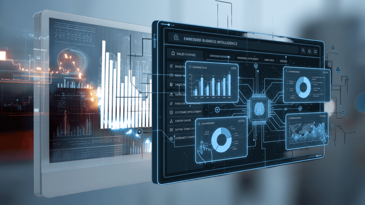
Self-service business intelligence (BI) is the practice of enabling employees—regardless of technical skill level—to independently access, analyze, and visualize data without relying on IT or data teams. Using intuitive, no-code tools like drag-and-drop dashboards, prebuilt templates, and built-in connectors to data sources, users across departments—marketing, sales, HR, finance, and operations—can generate their own reports and insights in real time.
This approach speeds up decision-making, eliminates IT bottlenecks, and promotes data democratization across the organization. Employees gain autonomy while still operating within governance frameworks set by IT and BI leaders.
The most effective self-service BI tools are designed to be accessible, reliable, and scalable. They empower non-technical users while maintaining strong data governance and security. Look for platforms that deliver the following capabilities:
Self-service business intelligence (BI) tools empower non-technical users to analyze and visualize data without relying on IT teams. With intuitive interfaces, drag-and-drop functionality, and pre-built templates, these tools enable users to create dashboards and reports that drive data-driven decisions.
By simplifying data processes and integrating seamlessly with multiple sources, self-service BI tools enhance agility, reduce bottlenecks, and deliver real-time insights, making them essential for organizations aiming to scale smarter and faster.
In traditional BI models, the flow of data is centralized—IT teams control access, generate reports, and often act as gatekeepers to critical insights. While secure, it’s also slow and limited to a small group of technical experts.
Self-service BI flips that model. The data structure stays the same, but now, business users can directly access and interact with their own data.
This approach increases agility, reduces IT backlog, and puts decision-making power in the hands of the people closest to the work.

Self-service BI isn’t just about faster dashboards—it’s about transforming how decisions are made at every level of the business.
For IT and BI teams, it clears out the ticket queue so they can focus on infrastructure and strategy. For end users, it means real-time answers, more confidence, and data they actually understand.
And for the organization as a whole? It means decisions happen faster, innovation moves forward, and people start speaking a shared language—data.
When employees are empowered to interact directly with their data, they begin spotting patterns, making informed calls, and collaborating around facts—not assumptions.
A well-implemented self-service BI solution delivers broad and lasting impact across the organization. It empowers users, streamlines operations, and supports a culture of data-driven decision-making. Key benefits include:
All of this adds up to a smarter, more agile organization—one that knows what’s working (and what isn’t) and can pivot accordingly.
Self-service BI works as part of your organization’s larger data architecture. A self-service BI platform works by being connected to data warehouses and various sources of data. Once the platform is set up, managers grant users access, and users can then customize their data with dashboards and individual reports.
That’s how self-service BI works generally, but depending on your organization and industry, you may see differences in how the tools are implemented, what functions they’re used for, and how they benefit the company. Here are some examples of how different industries use self-service BI tools and how self-service BI works for them:
Healthcare organizations can use self-service BI to better understand public health trends and treat patients more effectively. Self-service BI allows users to catch bottlenecks in the services hospitals provide, such as importing patient records, scheduling appointments, optimizing costs of services, and purchasing pharmaceuticals and medical devices more efficiently. When employees understand the data, hospitals can become more efficient and patients can get better treatment and faster follow-up. Healthcare organizations can also use self-service BI to track what kinds of conditions people experience, the outcomes of certain treatment types, patient satisfaction rates, and how to better staff different departments.
Education is another excellent example of an industry that benefits from self-service BI. Think of all the data that a public school district collects each school year. Administrators and teachers need to compile this data into reports for state and federal funding, grants, size classification, and student support. If the district IT team was the only source for those reports, they would do little else with their workday.
Recycling companies and other eco-improvement organizations benefit from self-service BI. One of the toughest parts of this industry is trying to change people’s behavior on a large scale to benefit the planet. Employees constantly have to justify the work they do. To do this, organizations in this industry need to see data as a story. Self-service BI allows users to see trends, gauge the effectiveness of certain campaigns on people’s recycling habits, estimate the effects of sustainability-related legislation, and track their metrics in regard to how much pollution was likely avoided because of their efforts. With dashboards, users can create visuals to quickly illustrate the impact they’re having on the earth.
Banking and finance companies are another stronguse case for self-service BI tools. In the financial services industry, customers expect organizations to respond extremely quickly to shifting markets. Whether that’s a change in the stock market or a new tax, companies need to be nimble in changing their strategies, which requires many users in the organization to have access to real-time data through self-service BI. Financial professionals can also use self-service BI to identify high-value customers, emerging markets, promising businesses, and up-and-coming investments, so that their companies can provide the best services to their customers.
Human resource departments are not usually the first area that comes to mind when people think of data. However, self-service BI makes data accessible to areas of the business that have typically been excluded from making data-based decisions. With self-service BI, team members in HR can track data on recruiting campaigns, gauge employee performance, glean insights about employee satisfaction and retention, measure how people-related decisions influence larger financial initiatives of the company, and find trends in making teams more effective.
Self-service BI tools empower users to analyze and visualize data without relying heavily on IT teams. Here are some of the leading platforms:
These tools simplify data-driven decision-making, putting advanced analytics directly into users’ hands.
As with any new solution, there are several things to consider as you find the self-service BI tool that’s right for your organization. Here are some things to keep in mind as you search:
Look for tools that give you flexible options for presenting data, make it easy to collaborate with different teams, and can help all departments measure the metrics they’re looking for.
To make sure you are getting value for the cost of the self-service BI tool, see if the platform can handle the data types and metrics you need. On the other hand, make sure the product isn’t too technical, or people won’t use it to its full potential, and you’ll be paying for features you don’t use or need.
Demo the product first to test out its mapping capabilities, geospatial data functionality, drag-and-drop abilities, and collaboration abilities. The entire purpose of self-service BI is to make data more accessible, so make sure the tool is easy to use and intuitive to work in.
Your self-service BI tool should fit within your current data architecture. The tool should work with an organization’s existing cloud data warehouse, ETL tools, and BI tools.
Make sure that your self-service BI tool doesn’t sacrifice data governance for ease of use. It should allow administrators to make sure the right data is in the right hands.

There’s a wide range of self-service BI tools available today, each offering unique strengths depending on your needs. Some popular options include:
Adding one of these tools—or a combination—can make self-service BI more impactful by matching the specific needs of your organization.
Self-service BI is a win-win for end users and for the IT department. On a larger scale, it offers company-wide benefits like faster decision time, more updated data, better data literacy, and a deeper understanding of the business across many teams. At Domo, we believe that data is only as good as the people who can wield it. To see how self-service business intelligence can simplify reporting and bring insights to more teams, watch a demo of our platform.
While self-service BI offers many advantages, there are some important challenges to consider:
By planning for these challenges upfront, organizations can maximize the value of self-service BI while maintaining trust and data integrity.
Have additional questions about self-service BI or how to choose the self-service BI platform? We’re here with answers.
Self-service in BI refers to a user’s ability to access data on their own. In self-service BI, users can “self-serve” and explore data, create their own dashboards, and generate their own reports—without needing extensive technical training or contacting someone in IT.
Guided analytics is when a company sets up dashboards and charts in a platform. Users can see these visuals and make decisions based on them, but the platform is still owned by IT. If users want anything different, they’ll still have to contact IT, whereas in self-service analytics, users can create their own dashboards and explore data freely.
Managed enterprise BI is centrally managed, usually by the IT department. This software is great for testing data for accuracy, but it’s slow, requires users to interact with IT frequently, and often does not allow any customizable reports beyond a few pre-set-up dashboards. However, self-service BI is managed at lower levels—usually department levels—and is much more agile, as users don’t need IT to access or share data.
Self-service business intelligence is a type of business intelligence where users are allowed to access and explore data to make faster business decisions. Business intelligence, in general, can include self-service business intelligence, managed enterprise business intelligence, and traditional business intelligence.
Self-service reporting means users can create their own dashboards and generate their own reports. They don’t have to ask IT for any help. Users can generate and create reports on their own at any time, without making a request or waiting for a standardized automated report to come from someone else.