Intro
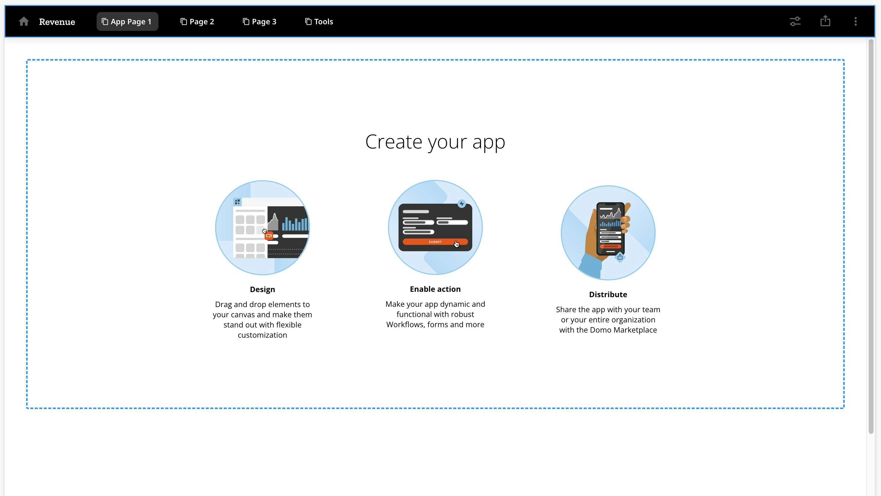
App Studio is a low-code app builder that allows anyone to create, distribute, and consume apps. App Studio levels up the interactive Domo dashboard experience you’re used to. The foundation is an intuitive and highly customizable drag-and-drop interface that allows you to create app layouts. The rich themes library lets you personalize everything from cards, tables, and fonts to color palettes and icons to align your app with your brand. Customizable themes make app design approachable for non-designers. The seamless navigational interface lets you collect all your content together in one place. Use components like tabs, buttons, card pop-ups, and natively integrated forms to create custom experiences and take actions directly from the app—actions like sending an email, triggering a DataSet, or moving to another page in the app. You can even bring in Domo Bricks to have more control over customization. App Studio also has Forms natively integrated.Writeback Capability
If you need to push data to a third-party application, you can add a writeback connector into your app and push data with the click of a button.
- Required grant
- Access App Studio
- Apps Home
- View an app
- Create an app
- Duplicate an app
- Embed an app
- Edit an app
- App editor
- App configuration
- Pages and navigation
- Add actions and elements
- Download content from a Doc Card
Required Grant
You must have the following grant enabled for your role to create or edit an app in App Studio:- Edit App (App Studio)
Access App Studio
Access App Studio from the Domo navigation header by selecting Apps.
The Apps Home displays.
Apps.
The Apps Home displays.
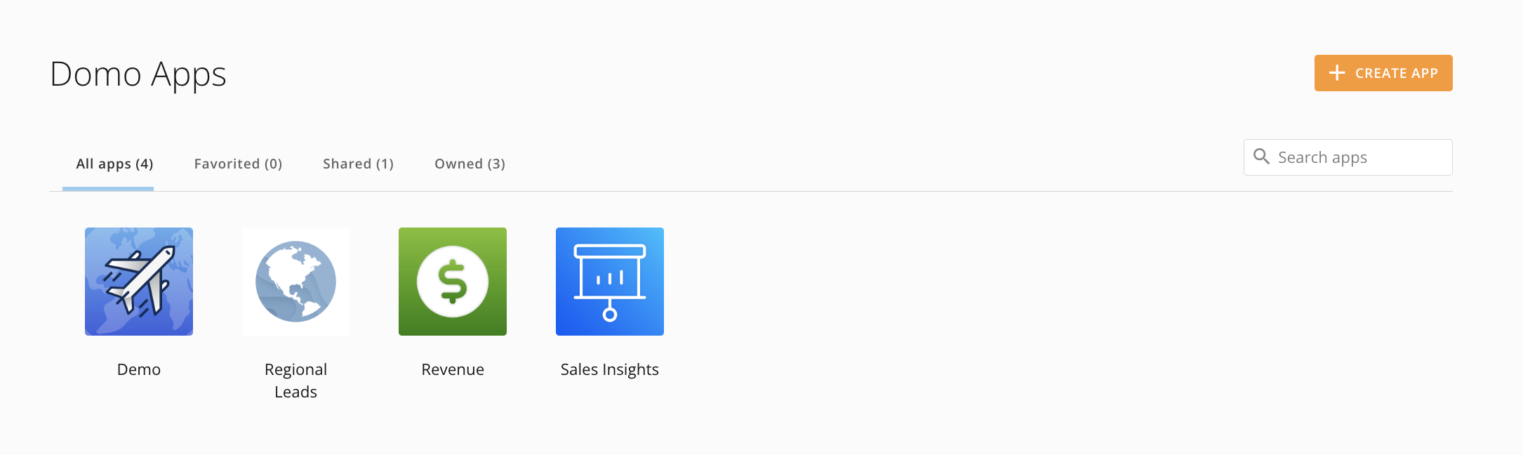
Apps Home


View an App
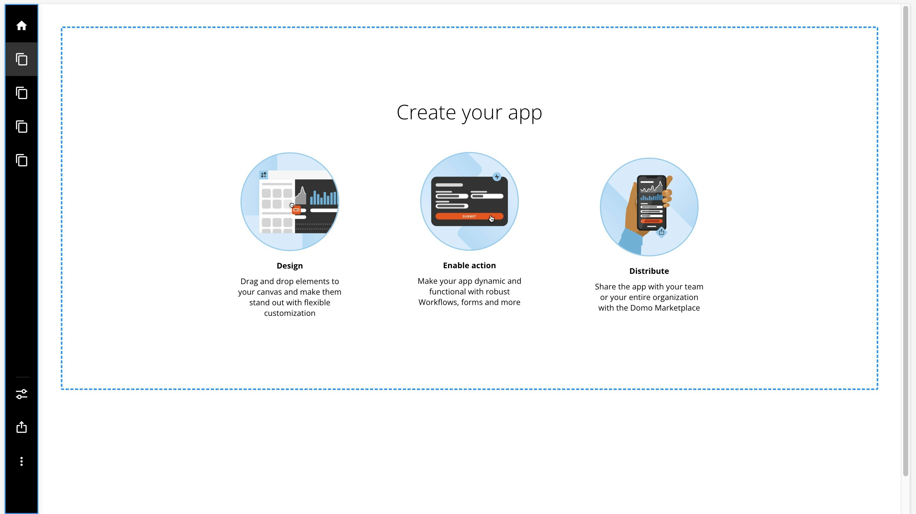
From Apps Home, you can select an app to open it. Inside the app viewer, the main navigation contains the following items.
| Icon | Item | Description |
|---|---|---|
 | All Domo apps | Takes you to the Apps Home . |
| — | The title of the app—unless it is hidden. | |
| — | App page(s) | All visible app pages. |
 | Controls | Allows you to create Filter Views and choose whether to make a Filter View the default for every app viewer. Create a Filter on a selected column and/or add a date range and graph by minute, hour, day, week, month, quarter, or year. Select Save to keep your Filter View or select Clear All to remove all Filter Views. |
 | Distribute | Allows you to share the app with users and groups within Domo; you can also enter an email address to invite a new user. You can compose a message and send an email notification of the shared app. Also allows you to embed the app with Domo Everywhere. See Embed an App below. |
 | Details | Opens the Details panel. In the panel, you can see the app title and the date when the app was last updated, and view and change the owner and the app’s data sources. You can also take the following actions:
|
 | AI Chat | Opens AI Chat. From here, you can start or continue a conversation with AI Chat and learn more about the data and cards powering your app. You can hide or change the order of the AI Chat feature by opening the app editor and going to Learn more about using AI Chat . |
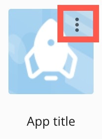
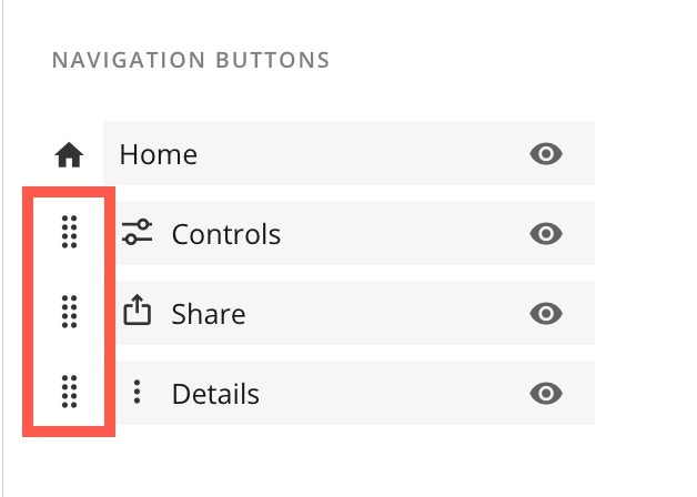
 Favorite to add the app to your list of favorites in Apps Home.
  Edit to open the
  Pages and navigation > Configuration (tab) > Navigation Buttons.
 Create an App
-
From
Apps Home, select + Create App.
App Studio opens and the Themes modal displays.


- Select an app theme or custom theme and select Apply to open the app editor. Learn more about themes and the app editor.
- In the app editor, edit the app theme and configuration and design your app pages.
- Add elements like cards, forms, and workflows and actions like buttons to your app.
- Select Save in the editor’s top navigation to keep your changes and display your app in the Apps Home.
Duplicate an App
When creating a new app with a similar configuration, you can duplicate an existing app to retain its components, structure, and design. Follow the steps below to duplicate an existing app.-
From
Apps Home, hover over the app you want to duplicate to display and select the vertical three-dot menu.
-
In the menu, select
 Duplicate.
The Duplicate app modal displays.
Duplicate.
The Duplicate app modal displays.

- Enter a name for your new app. The name must be different from the original.
- (Optional) Check the box labeled Duplicate Cards and other app components to duplicate each item in your new app, or leave the box unchecked to include the original items in your new app.
-
Select Duplicate App to create your new app.
A progress bar displays while your app is created.

Embed an App
Follow these steps to embed an app you have access to:-
From the
app viewer, select
 Distribute > Embed app to display the embed modal.
- (Optional) Check the boxes to allow interactions and filtering and allow export.
-
(Optional) In the Width (px) and Height (px) fields, adjust the dimensions for the embedded app.

-
In the Embed options
dropdown, select one of the following options:
-
Private — Only people who authenticate from a Domo account or API can view a privately embedded app.
You can follow links to example code for Client-side filters and Server-side filters.
Copy the share link or embed code for this privately embedded app.
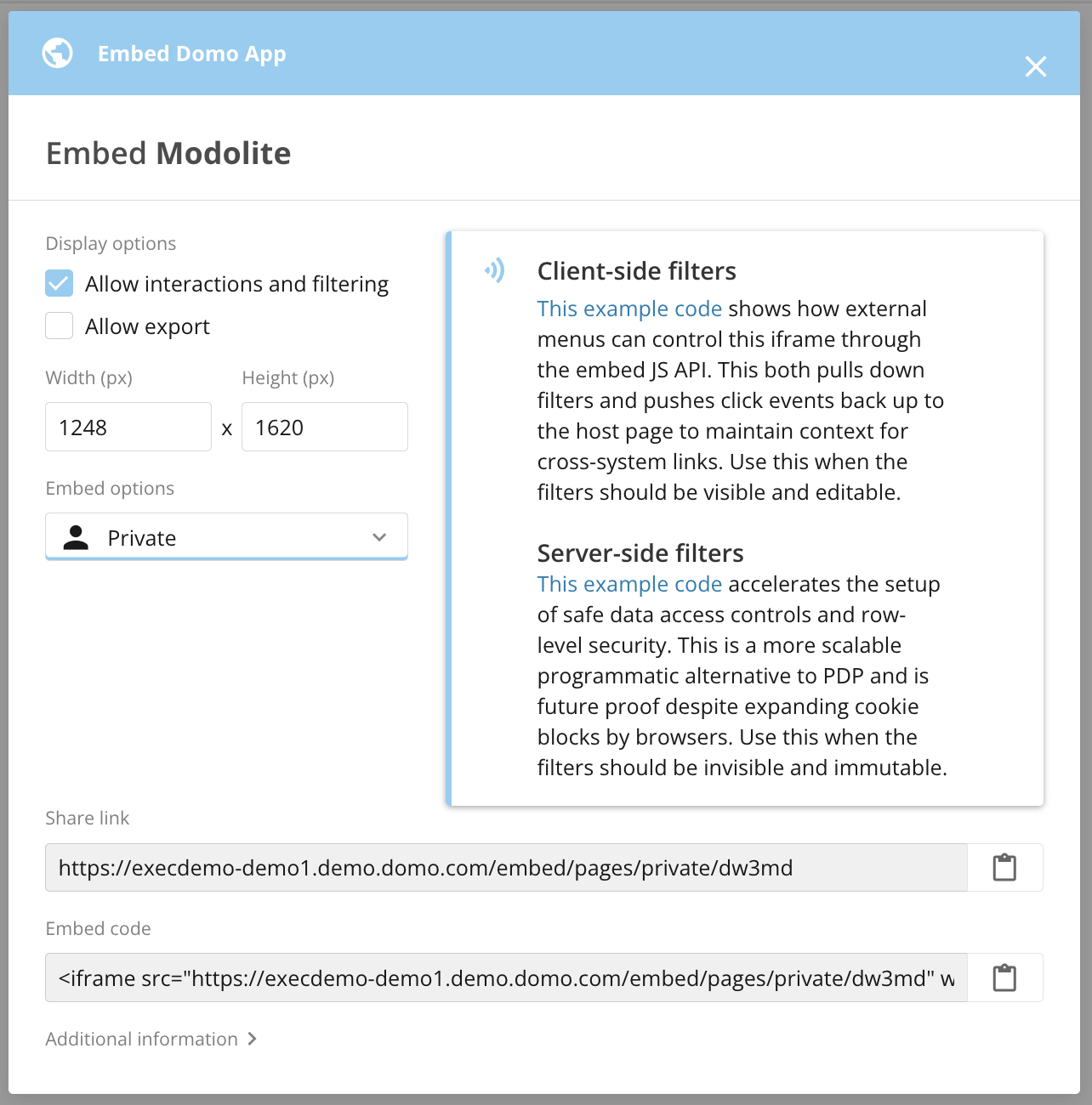
-
Public — Use a publicly embedded app to share open data with your customers, partners, or vendors on the web.
Copy the share link or embed code for this publicly embedded app.

-
Private — Only people who authenticate from a Domo account or API can view a privately embedded app.
You can follow links to example code for Client-side filters and Server-side filters.
-
Select
 Close to leave the modal.
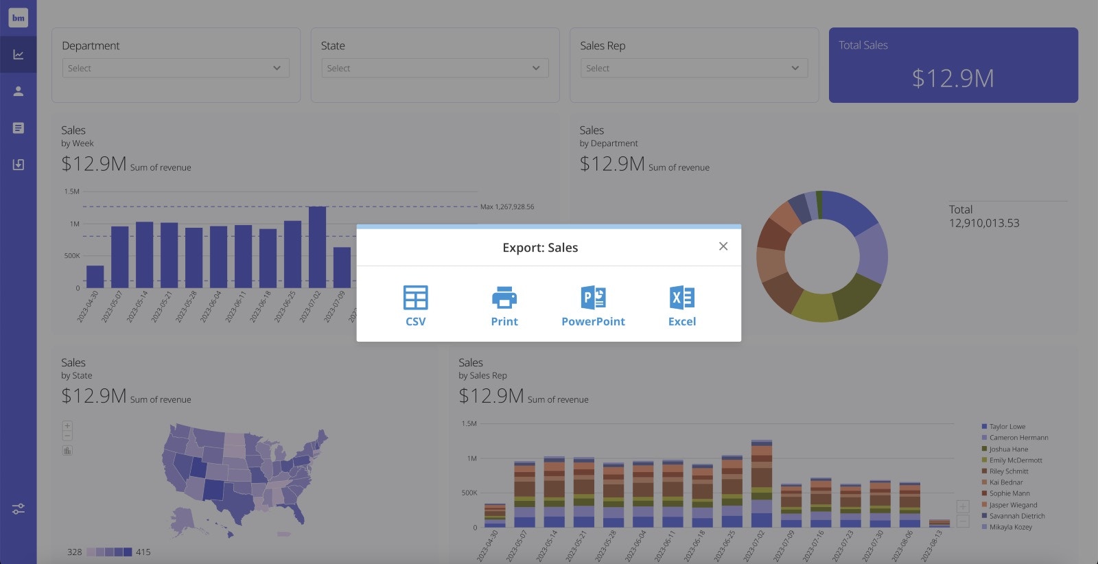
Export Embedded App Content
If you want users to be able to export content from an embedded app to a CSV file, PowerPoint presentation, Excel spreadsheet, or to print, check the box labeled Allow export while configuring the embedded app.
Edit an App
Follow these steps to edit an app:-
From
Apps Home, hover over the app you want to edit. Select More (vertical three-dot menu) > Edit.
The app editor opens.
 To make changes to the app’s main navigation, see Configuration Tab — Custom Navigation, below. To make changes to other areas of the app, see App Editor.
-
After making changes to your app, select Save in the editor’s top navigation.
The app editor closes, and the app displays fullscreen.

-
After you close the app editor, you can select
 All Domo apps to return to Apps Home.
 Tip: To open the app editor, you can select Details (vertical three-dot menu) >
 Edit in the app’s main navigation.
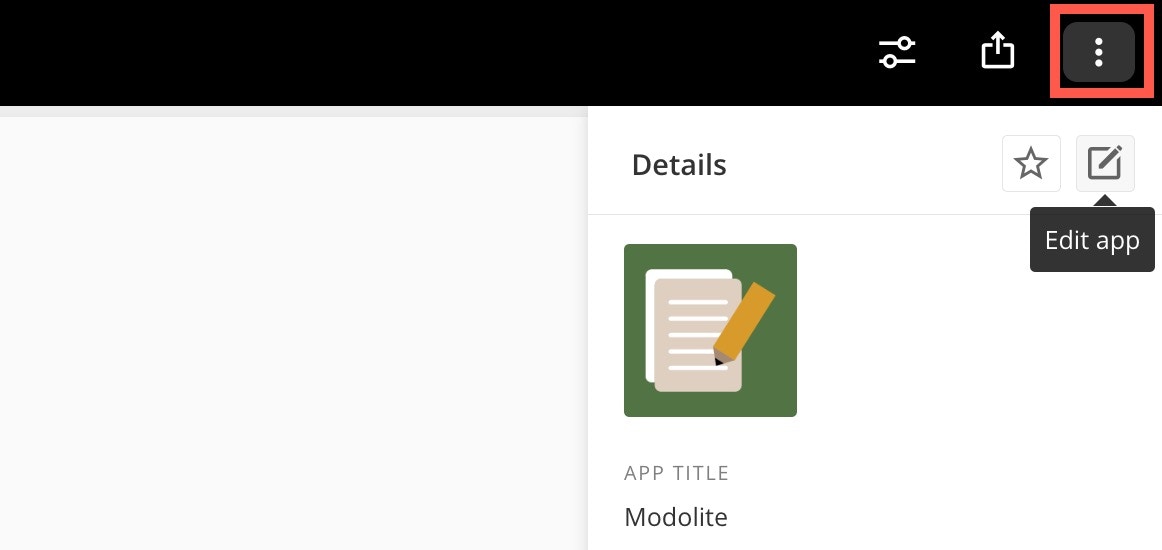
App Editor
There are four main areas in the app editor, labeled in the image below:- The main navigation
- The left navigation and side panel
- The canvas
- The right configuration panel

Main Navigation
The main navigation can display at the top of the app, as in the image above, or it can be oriented at the left side of the app. To learn how to change the orientation of the main navigation, see Configuration Tab — Custom Navigation. Wherever it displays, the main navigation contains the following options:-
Desktop/Mobile toggle — Toggle between viewing the app in desktop or mobile mode.
-
(Desktop mode only) Actual Size editor — In Desktop mode, you can toggle the Actual Size editor. The editor allows you to accurately view the size of app elements as you edit instead of having to save changes to view them. You can toggle the Actual Size editor off to view the settings and configuration panels. The Actual Size editor is off by default, so you must turn it on for each editing session when you want to use it.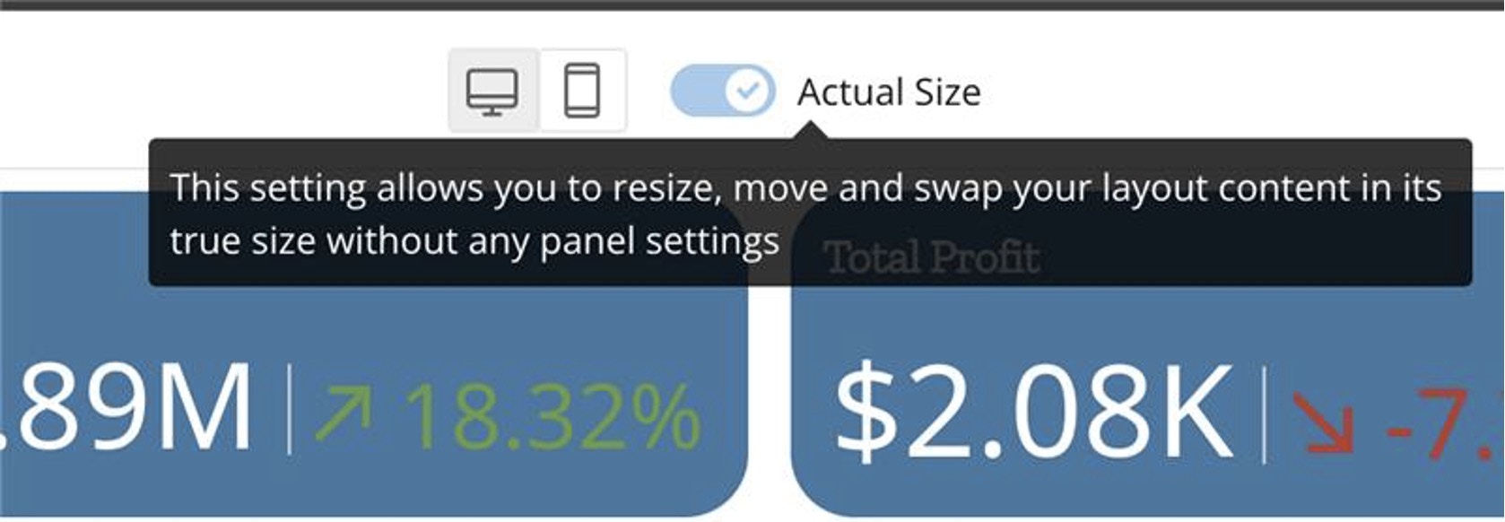
- Save — Saving keeps your changes to the entire app and closes the edit mode.
-
Cancel — If you have made changes to the app, selecting this option displays a dialog to confirm that you want to discard them.
To return to the editor and save your changes, select Continue Editing.
To discard your changes and close the edit mode, select Don’t Save Changes.

Left Navigation and Side Panel
From the left navigation, you can go to the following sections:- App theme
- App configuration
- Pages and navigation
- Add actions and elements
Canvas
The canvas is where your app displays as you build it. You can test colors, fonts, and other theme elements, drag a layout and other elements onto the canvas, and add content to your app.Right Configuration Panel
When you add an action or element to the canvas, you can configure it in the right panel. Close the panel by selecting Close.
Page Settings
When the right configuration panel is closed, you can select anywhere on the canvas to open the Page Settings in the right configuration panel.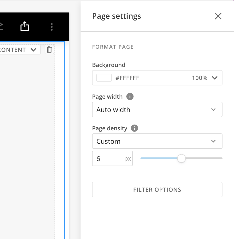
Format Page
Under Format Page, you can use the dropdowns and other controls to configure the following:- Background — Choose the background color and intensity using the color picker.
- Page width — Choose from the following page width options:
- Fixed width — The page width is fixed and the margins adjust with the size of the screen.
- Auto width — The margins are fixed and the page adjusts with the size of the screen.
- Page density — Page density determines the space around objects on the page. The options are Default (4 px), Comfortable (8 px), Compact (2 px), Nil (0 px), and custom.
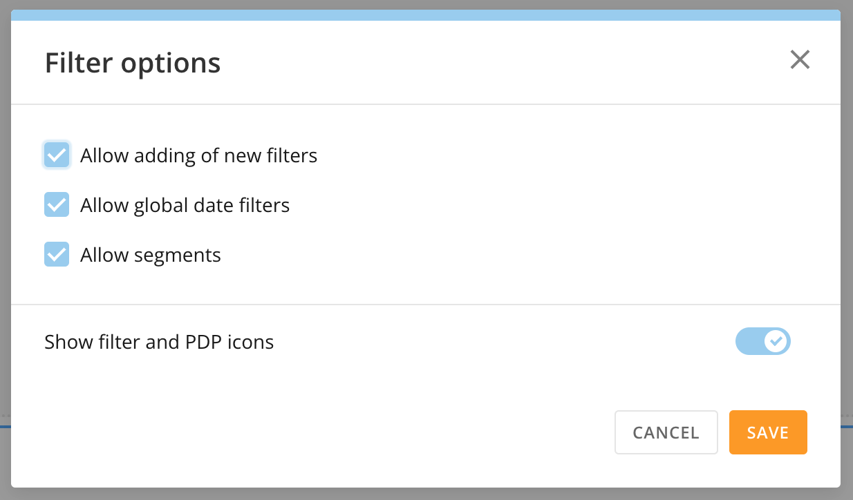
Filter Options
Selecting Filter Options opens the Filter options modal. In the modal, the following settings are enabled by default. You can choose to disable them.- Allow adding of new filters
- Allow global date filters — Allows the global date to filter the page.
- Allow segments — Allows all segments to be displayed.
- Show filter and PDP icons — Toggle this switch to hide filter and PDP icons. They can obscure your view of your content.
 App Configuration
In App configuration, there are two tabs: Info & Permissions and Filter Options.
In the Info & Permissions tab, you can change the name and description for your app and choose an icon to represent it in the Apps Home. You can also add other people/groups as app owners and choose whether to identify them of the change. Locking the app prevents anyone besides owners and admins in your Domo instance from editing it.
To save your changes to any of these settings, select Save in the editor’s main navigation.
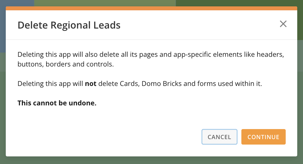
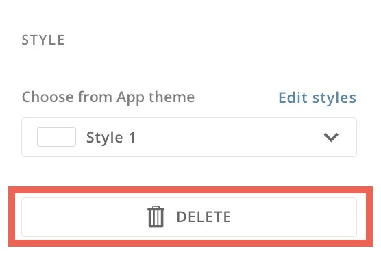
Delete an App
To delete your app, select Delete.
A dialog displays, confirming that deleting the app also deletes its pages and app-specific elements.
To complete app deletion, select Continue. Select Cancel to return to the App configuration panel.
Delete.
A dialog displays, confirming that deleting the app also deletes its pages and app-specific elements.
To complete app deletion, select Continue. Select Cancel to return to the App configuration panel.

Configure Persistent Filters
You can configure persistent filters in the Filter Options tab of the App Configuration section. Making a filter persistent means that when app users turn on the filter, it takes effect across all app pages using some or all columns in a DataSet. You can also configure other elements, like Variables and date filters, to persist throughout the app.-
Use the dropdown to choose whether all columns or only selected columns persist as filters across all app pages. The default is none.

-
If you choose to use only selected columns, choose the filter columns that should persist.
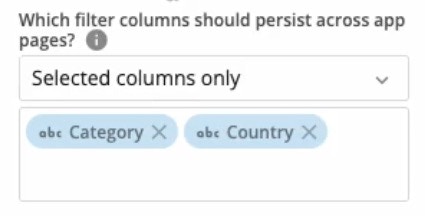
-
After choosing your filter columns, check the box(es) to enable these other options:
- Persist interaction filters — When enabled, if an app user applies a card-specific filter, like a chart element, it persists across the app.
- Persist date range filters — When enabled, any date range filter that an app user applies persists across the app.
-
Persist Variable controls — When enabled, variable control values persist across the app.
Note: Variable control values are only applied to pages that contain that control. If you want to persist Variables across the app, you must add the control to each page where you want the value to persist. Learn more about Variables and controls.
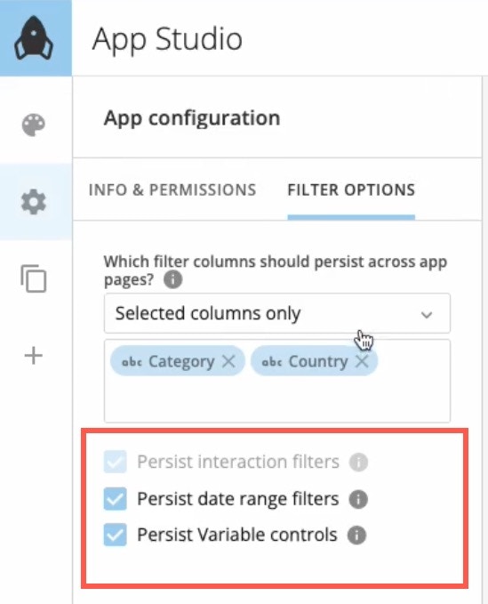
- Save your changes.
Configure Persistent Filters for a Set of Cards
Persistent filters can be set at an individual card or app level. To apply persistent global filters to a specific set of cards, follow these instructions:- Set your filters to affect all cards on your app globally. For any cards you do not want to be filtered, you can edit their individual setting by navigating to the card and then selecting Filter Exceptions from the card details edit menu. OR
- Place all of the cards you want to be filtered on one app page. After setting up the cards on the same page, set up the interaction filters to affect these specific cards, then move the cards to your desired locations on different pages.
Test Persistent Filters
You can confirm whether a filter persists by going to the Controls menu. Persistent filters have a globe icon.
 Pages and Navigation
Pages and navigation contain two tabs: Order and Confirmation, described below. See Page Drill to learn how to use that feature.
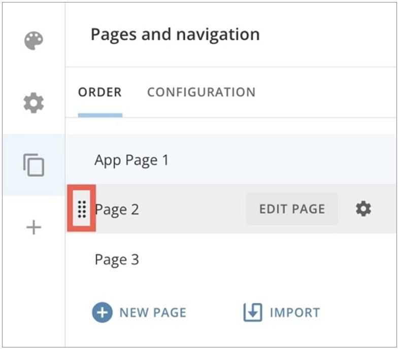
Order Tab
In the Order tab, you can view and reorder the pages in your app. You can also import dashboard content from your Domo instance.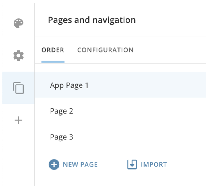
Import Dashboard Content to an App
When you import a dashboard, the card(s) you select from the dashboard can be duplicated in the app, or you can bring the original card(s) into the app. If you bring original content into the app, any changes you make to the content within the app are reflected for the content where it resides in Domo. You can choose to import all content from the dashboard or select specific elements for import. Importing content to the app applies all configured themes to the content inside the app, independent of how the content displays outside the app. This standardizes the look and feel of content throughout your app.- To import a dashboard from the Order tab, select Import > Dashboard. A modal displays where you can search for and select a dashboard from your Domo instance.
-
Select Next. The Import options display on the right side of the modal.

- In the Import options, enter a name in the Page name field as you want it to display in the app.
- Check the boxes if you would like to duplicate cards, include card interactions, and include Filters.
- Choose the content from the dashboard that you want to import—you can choose all content or select specific elements for import.
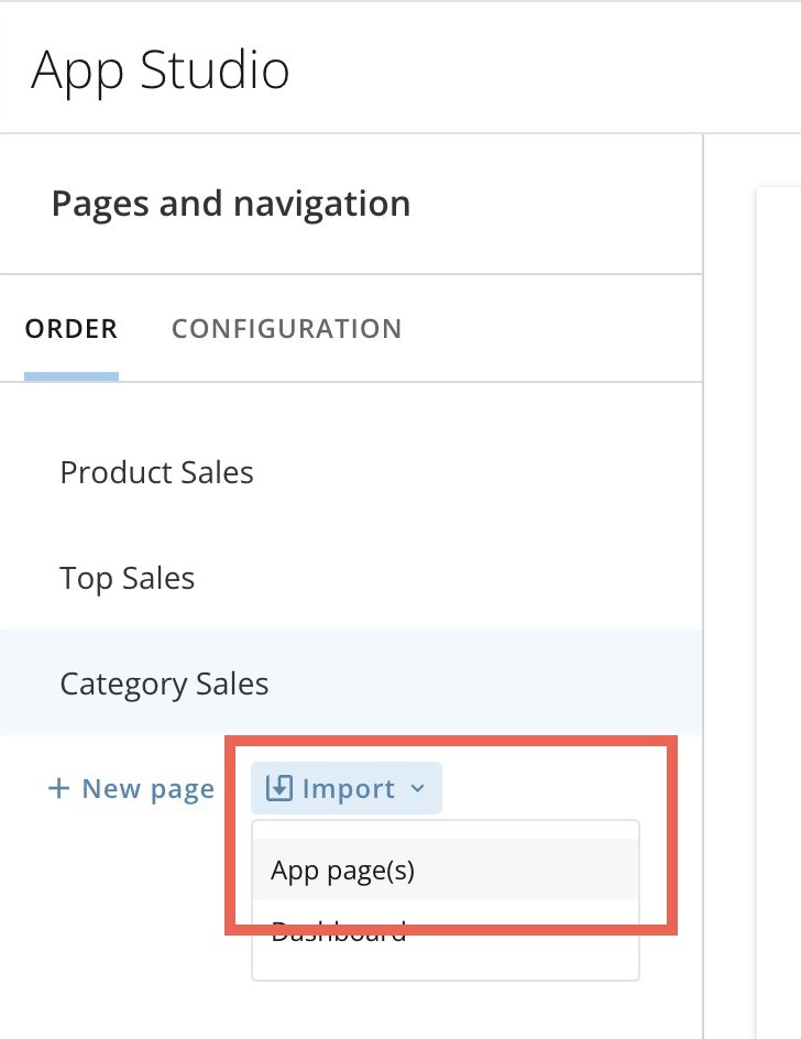
Import an App Page to Another App
You can import pre-existing pages from another App Studio app into your app. To begin: Go to the App Studio app to which you want to import a page from another app. Open the app in edit mode.-
Go to
 Pages and navigation > Order tab.
-
Select Import > App page(s).
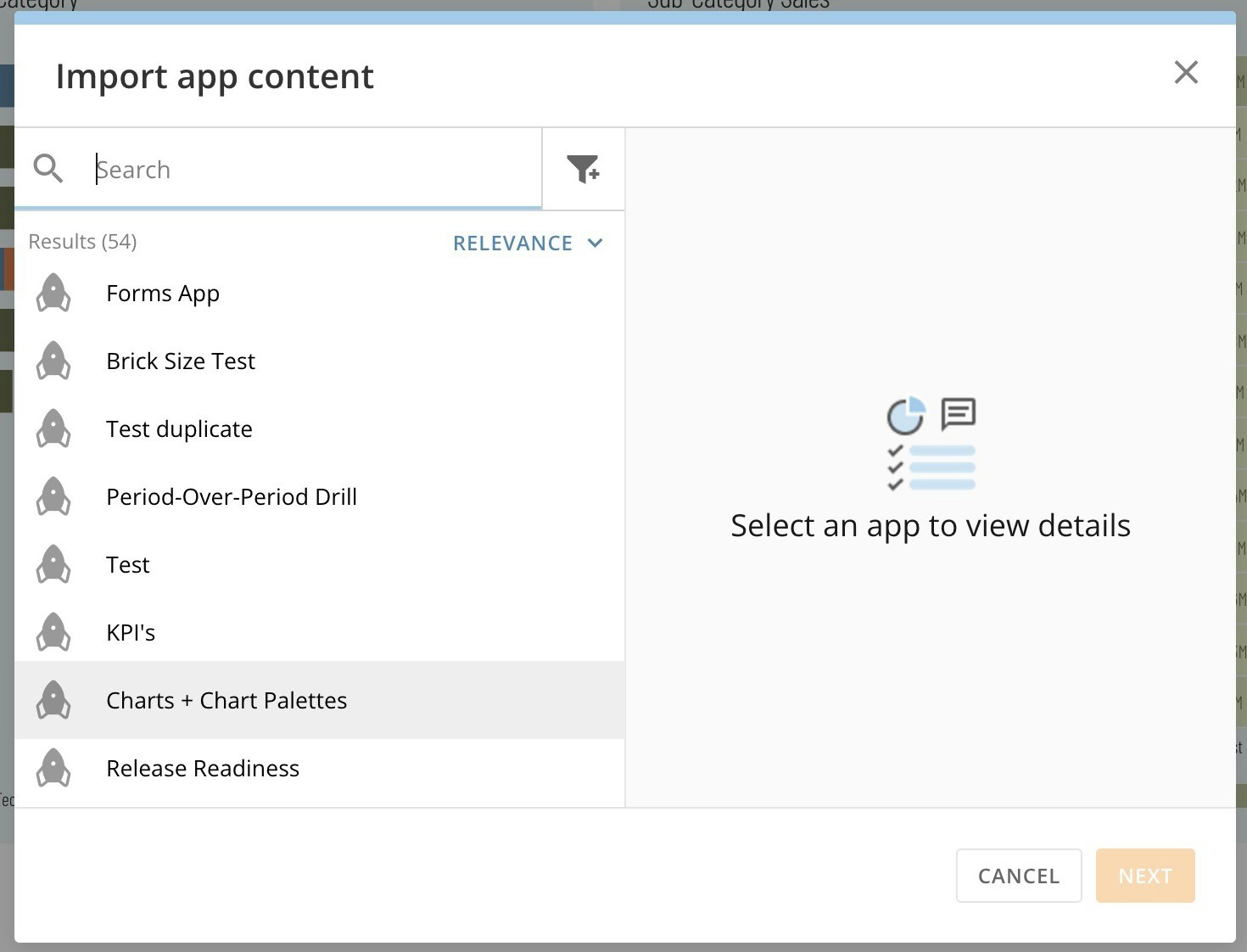
The Import app content modal displays.
-
In the modal, search for and select the app from which you want to import a page. Select Next to choose the import content.
-
Under Import options, choose whether you want to a) duplicate cards, b) include card interactions, and/or c) include filters by checking the appropriate boxes.

- Now choose which pages from the app to import or choose Select all.
- When finished, select Import. A bar displays the import progress. When the import is complete, save the changes to your new app before closing.
Add an App Page
Follow these steps to add a page to your app:-
In the Order tab, select + New Page.
A modal displays where you can name the page.
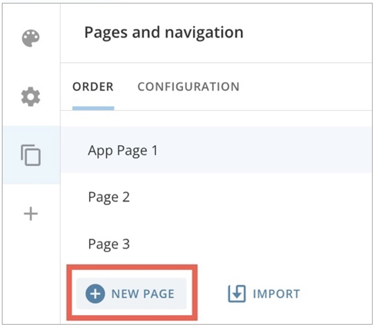
- In the modal, select Create and Continue to add the page to your Order tab or Cancel to discard the page. When you add the page, it displays at the bottom of the list of pages. You can reorder the pages to change their position.
Edit an App Page
-
After you create a page in the Order tab, hover over it and select
 Edit page information.
The Page settings modal displays.
Edit page information.
The Page settings modal displays.
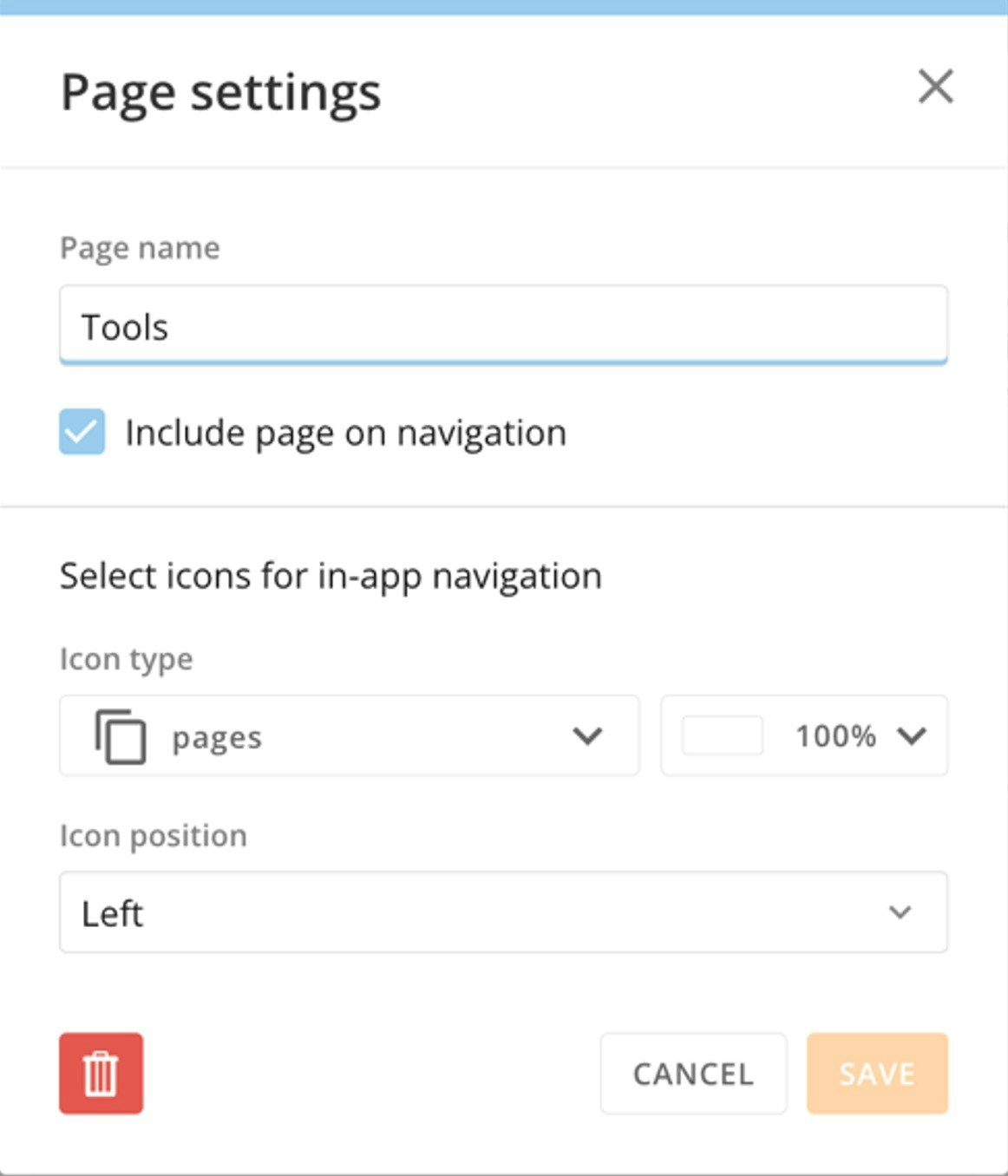
- (Optional) Edit the page name.
- (Optional) Uncheck the box labeled Include page on navigation to remove the page from the app’s main navigation. This is most often done when the page is being used as a drill view. See Page Drill to learn more. You can also hide a page if you don’t want users to be able access it, but don’t want to delete it.
-
Choose the icon to display for the page in the app’s top navigation. The default icon is pages
 . You can also adjust the color, opacity, and position/alignment of the icon.
- After making your changes, select Save to keep your changes and close the modal or Cancel to discard your changes.
Delete an App Page
To delete a page from Order tab, hover over the page and select Edit page information.
The Page settings modal displays.
In the modal, select
Edit page information.
The Page settings modal displays.
In the modal, select  Delete.
A warning dialog displays to confirm deletion. Deleting a page cannot be undone.
Select Delete Page to remove the page or Cancel to keep the page.
Delete.
A warning dialog displays to confirm deletion. Deleting a page cannot be undone.
Select Delete Page to remove the page or Cancel to keep the page.
Configuration Tab — Custom Navigation
In the Configuration tab, you can choose to show or hide the app’s main navigation.


 Show/Hide.

Page Drill
Page Drill allows app users to move to a different page of the app by selecting a card. Filters from the card persist through to the new page, which contains more detailed information and additional insights unavailable with the card alone. The new page is called a drill view because you can choose to hide it from the app’s main navigation and make it accessible only through a drill.Configure Page Drill
To configure a Page Drill, follow these steps:- Select your card on the canvas to open the right configuration panel.
- In the configuration panel, go to the Actions tab.
-
Under Desktop, use the dropdown to select Open content > Open page in app.
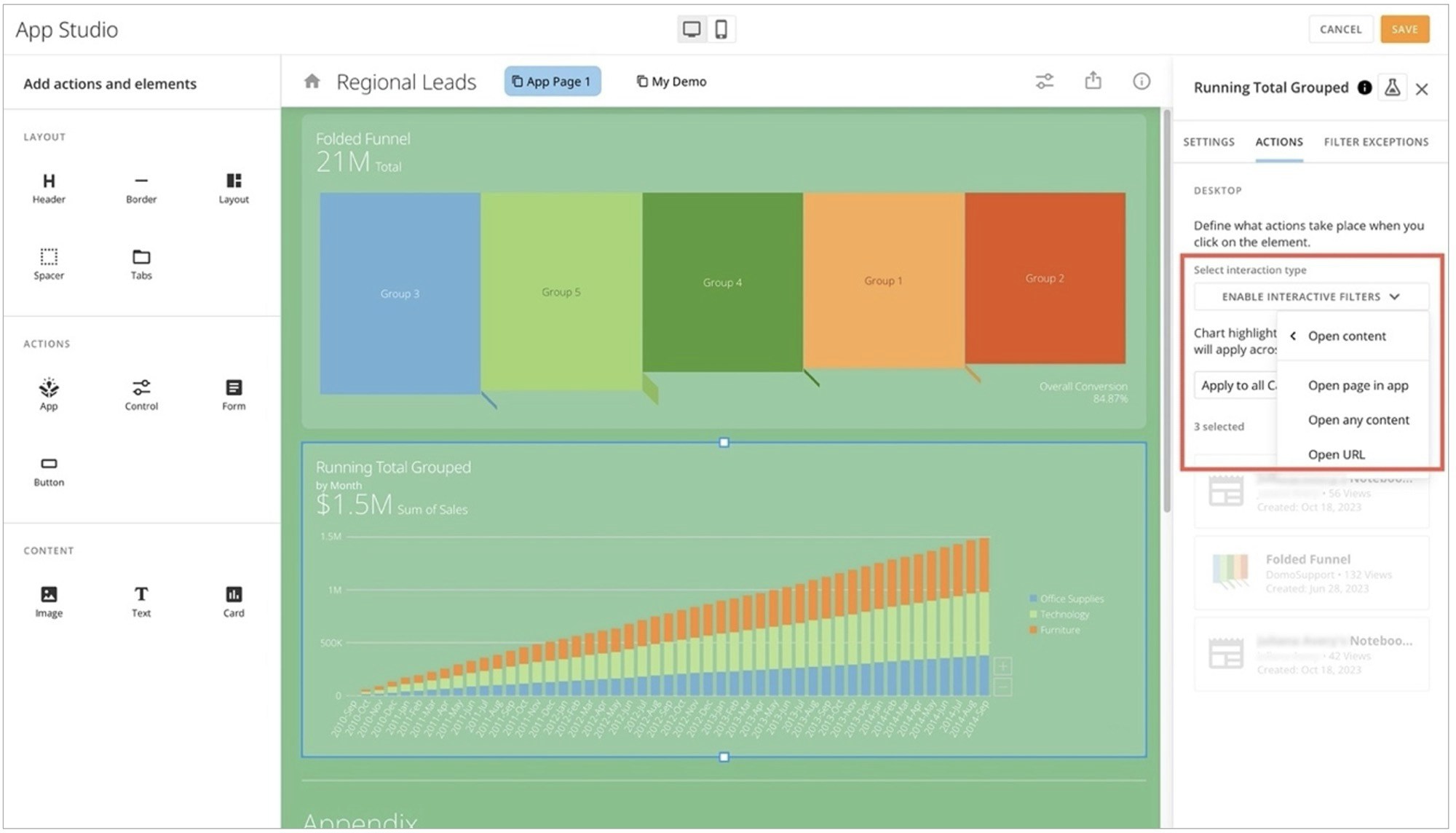
-
In the second dropdown, select the page to open as the destination or drill view.

-
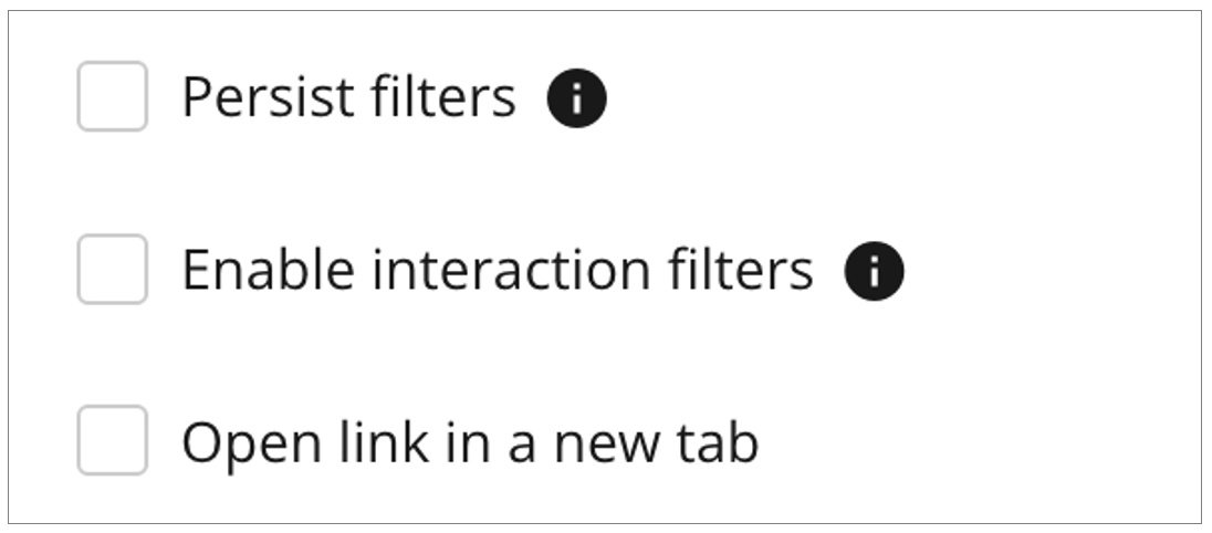
If you want to use any of these options, check the applicable boxes:
- Persist filters — Filters applied to the app page carry forward to the destination page or drill view.
- Enable interaction filters — When this option is selected, interactive charts on cards are enabled. However, tooltips and screen readers will not detect navigation to the drill view.
-
Open link in a new tab — Opens the drill view in a new browser tab.
- Save your changes.
Hide Drill View
- Navigate to Pages and navigation > Order tab.
-
Locate the page you are using as the destination of your Page Drill and hover over it to select
 Edit page information.
The Page settings modal displays.
Edit page information.
The Page settings modal displays.
-
In the modal, uncheck the box labeled Include page on navigation. This removes the page from the app’s main navigation and makes it accessible to app users only as a drill view.
Note: The app landing page cannot be removed from the navigation.

- Select Save to close the modal.
Add Actions and Elements
In the Add actions and elements section, you can customize app layout and actions available to app users, and add Domo content like cards and workflows.
You can drag an action or element to your canvas to add it to your app. The configuration panel opens so you can configure the item.
Add actions and elements section, you can customize app layout and actions available to app users, and add Domo content like cards and workflows.
You can drag an action or element to your canvas to add it to your app. The configuration panel opens so you can configure the item.

Add a Header
Dragging a Header element to the canvas gives you the option to Edit or
  Delete.
- Selecting
 Edit displays the Header configuration panel. In the panel, you can enter a label or title for your header and choose a header style from the App theme styles. If you select Edit styles for the style you choose, the left panel displays the header style editor. Any changes you make are reflected on the canvas for a real-time preview.
 - Selecting
 Delete displays a dialog to confirm that you want to remove the header. Select Remove Header to delete.
Add a Border
Dragging a Border element to the canvas displays a horizontal line. Select the line to open the configuration panel. In the panel, selecting Delete displays a dialog to confirm that you want to remove the border. Select Remove Border to delete.
Choose a Layout
Dragging a layout onto the canvas displays the Choose a layout modal. Look through the potential layout options and hover over the one you want to use and choose Select to import the layout to the canvas.
Add a Spacer
Dragging a spacer to the canvas creates an area of blank space between other elements. Select the spacer to open the Spacer configuration panel on the right. In the panel, selecting Delete displays a dialog to confirm that you want to remove the spacer. Select Remove Spacer to delete.
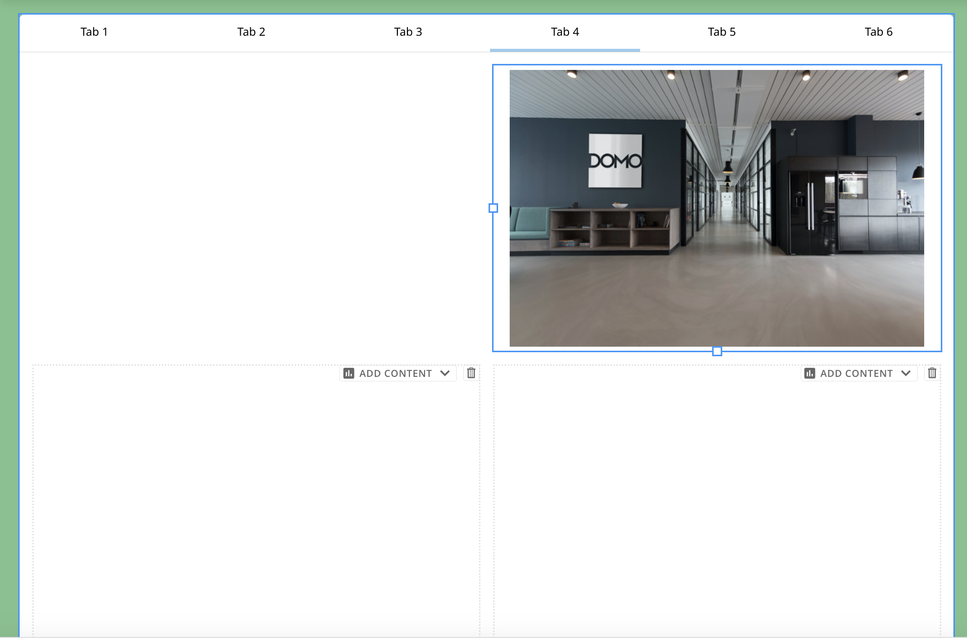
Add Tabs
Dragging a Tabs element to the canvas displays an interface with three tabs and opens the configuration panel.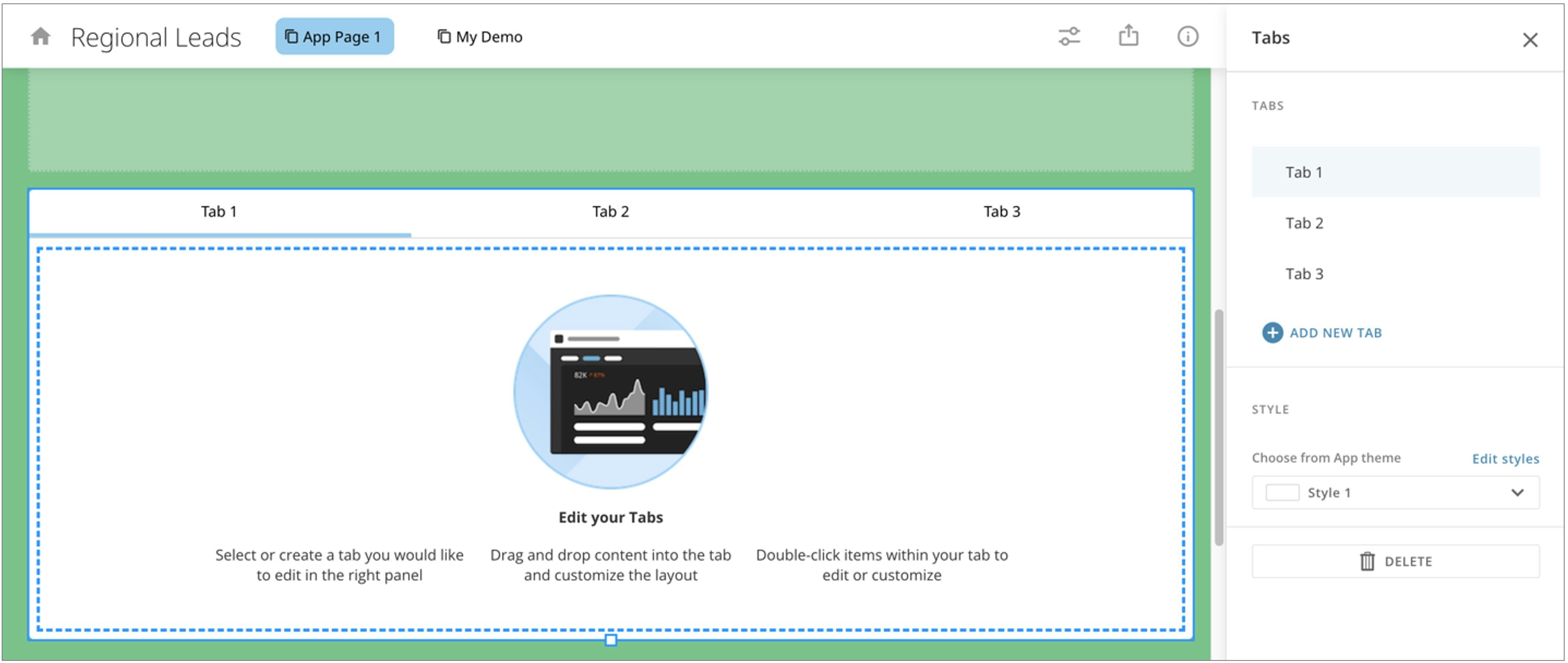
 Close.
Tabs Styles
In the panel, you can select from one of two styles for your tabs. Select Edit styles to make changes to either style.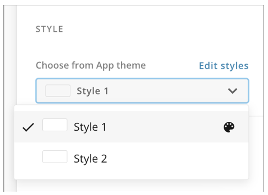
Add a New Tab
You can add tabs from the panel by selecting + Add New Tab. This adds a tab to the end of the tab list with the next default number.
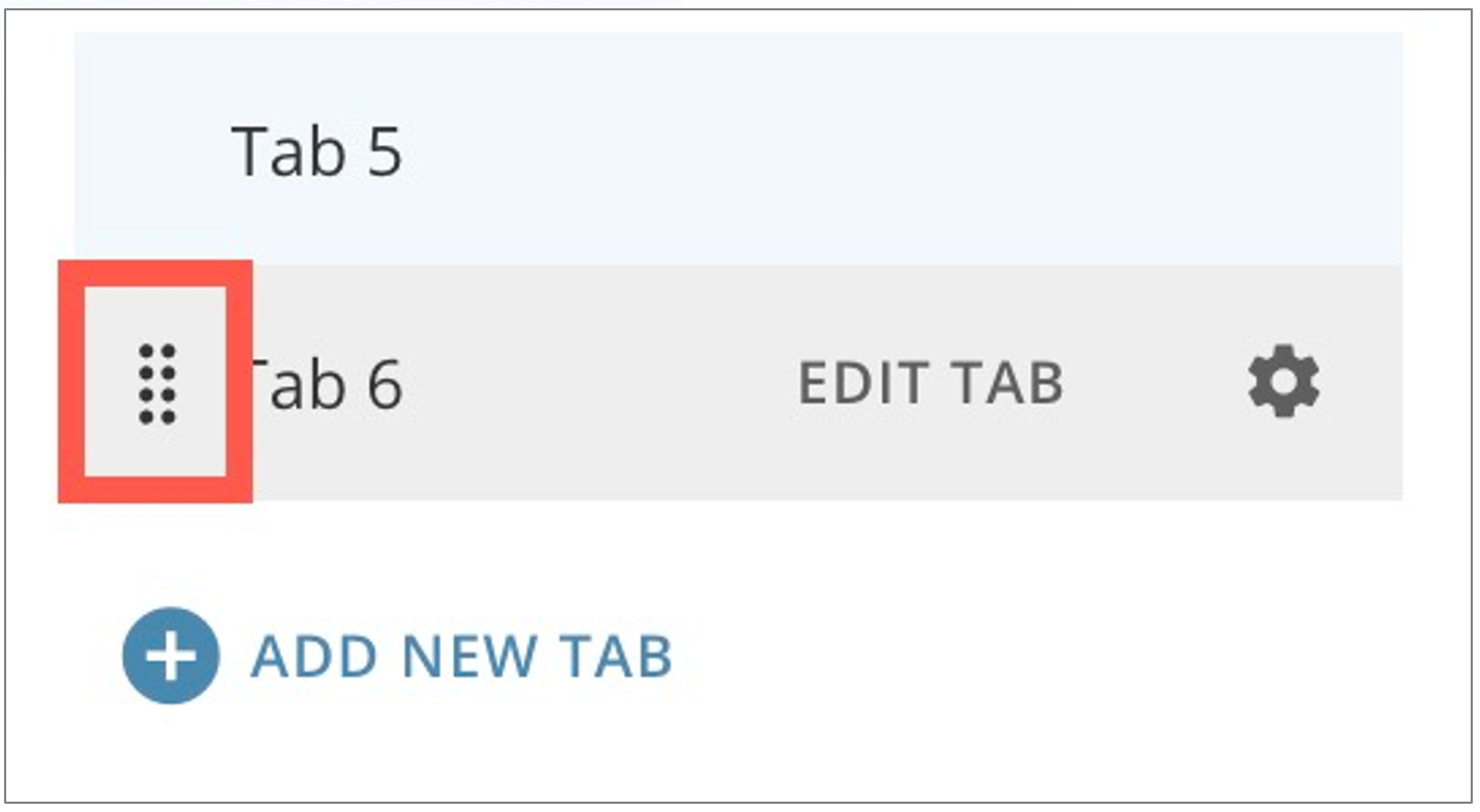
Edit Tabs
In the panel, you can edit a tab by hovering over a tab and selecting Edit Tab. This selects the tab on the canvas.
Delete Tabs
You can delete tabs individually or delete the whole tabs element. Whether you delete tabs individually or as an element group, deleting tabs moves all cards or Domo Bricks in those tabs to the appendix. Forms in deleted tabs are removed from the app. Content like buttons and controls created within tabs are permanently deleted. You cannot undo a deletion.-
To delete an individual tab, hover over the tab in the right panel.
Select
 Edit tab information to display the Tab label modal.
Select
Edit tab information to display the Tab label modal.
Select
 Delete.
A dialog displays to confirm deletion.
Select Delete or Cancel.
Delete.
A dialog displays to confirm deletion.
Select Delete or Cancel.
-
To delete a tab element, select
 Delete in the right panel.
A dialog displays to confirm deletion.
Select Delete or Cancel.
Delete in the right panel.
A dialog displays to confirm deletion.
Select Delete or Cancel.
Add a Domo App
Dragging an App action onto the canvas opens the Select an App modal. Search for and select the app you want to import and select Get or Cancel.Add a Variable Control
Dragging a Control action onto the canvas allows you to add a Variable control to the app page. To learn about Variables and controls, see the Variables | Overview.Add a Form
Dragging a form action onto the canvas opens the form editor. See our Forms documentation to learn more.Add a Button
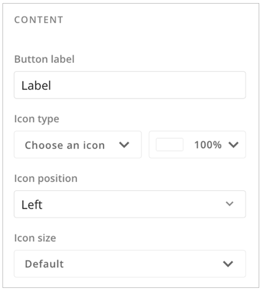
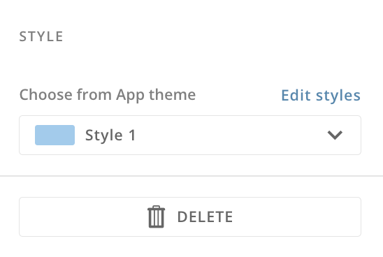
Dragging a button action onto the canvas opens the right panel with two tabs: Settings and Actions.Settings Tab
In the Settings tab, you can configure the following:- Enter text for the button label
- Select an icon from the available options or choose No icon
- Select the button color and opacity
- Choose the icon placement on the button: top, left, or right
- Choose the icon size: default, small, medium, large, or extra large
 Delete to remove the button.
Actions Tab
In the Actions tab, use the Select interaction type dropdown to define what action takes place when you press the button.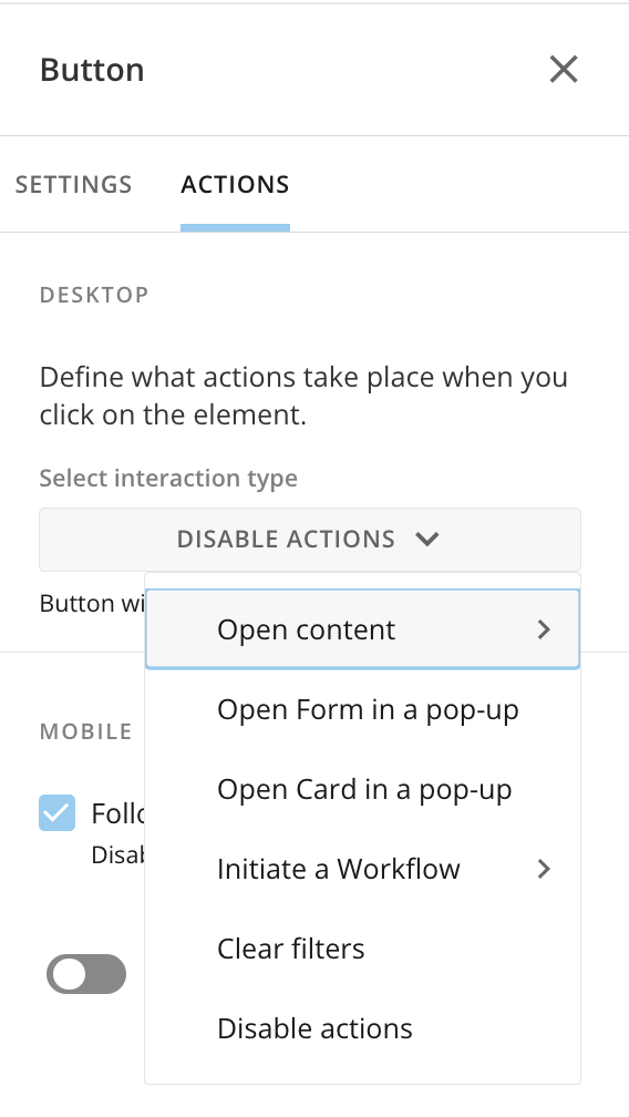
Open a Card in a Pop-Up
When you configure a button to open a card in a pop-up, you must search for and select the card you want to open when the button is selected. Save the card and the changes to your app.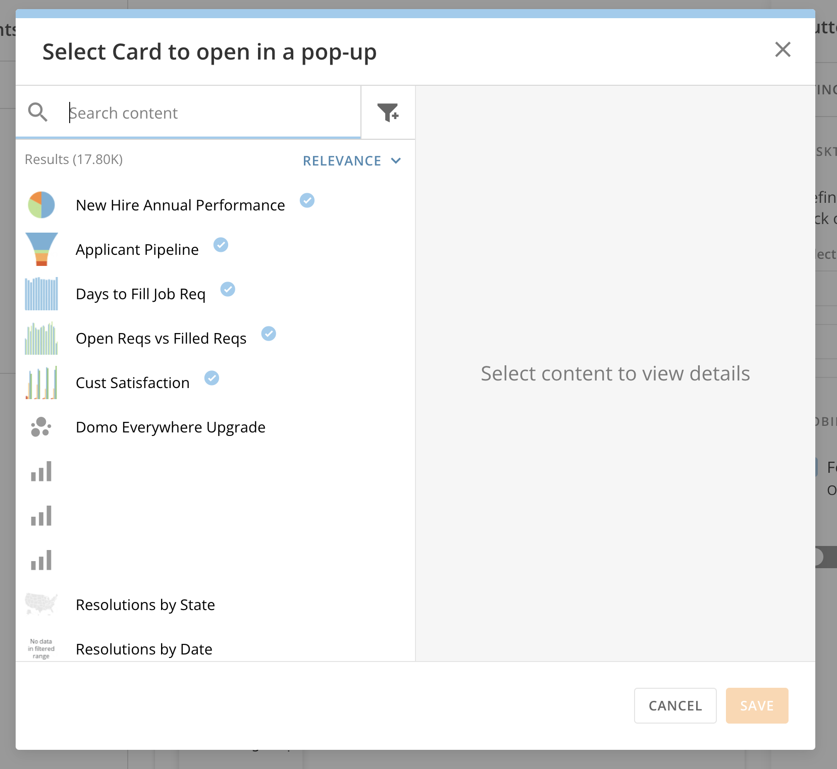
Choose a Different Card
You may need to update the card that displays when a button is clicked.- From the Actions tab of the button configuration panel, select Change.
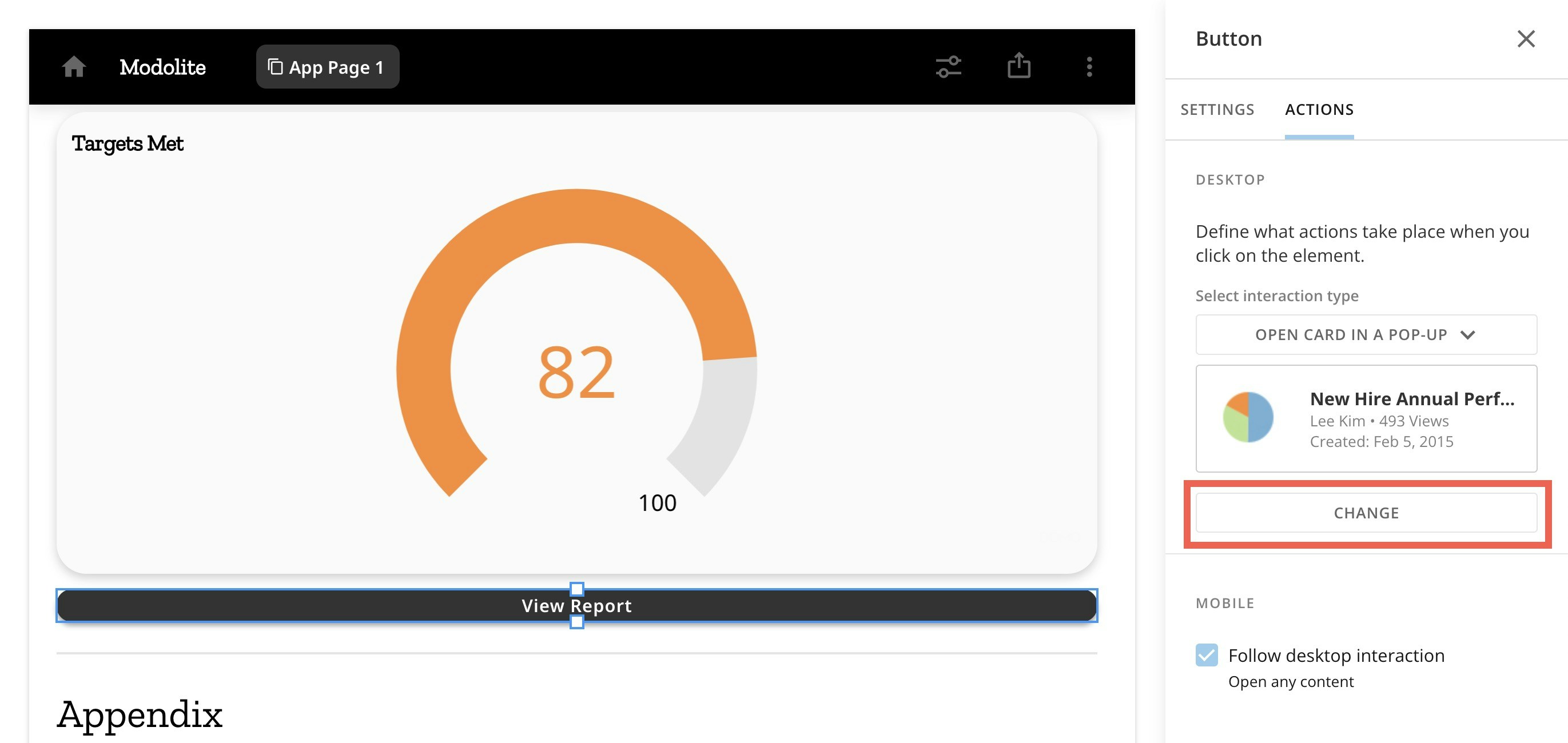
- Search for and select a different card. Save the card and save your app changes.
Add an Image
Dragging an Image element onto the canvas allows you to select an image from your machine to add to your app.Add Text with a Notebook Card
Dragging a Text element onto the canvas displays the Notebook Card toolbar on the canvas and opens the configuration panel as a notebook. Learn more about Notebook Cards. In the configuration panel, select Edit to edit the card content or
  Close to close the notebook.
The panel has three tabs: Settings, Actions, and Filter Exceptions.
Close to close the notebook.
The panel has three tabs: Settings, Actions, and Filter Exceptions.
Settings Tab
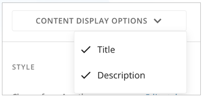
In the Settings tab under Content, you can choose Edit Card Title & Description or Content Display Options.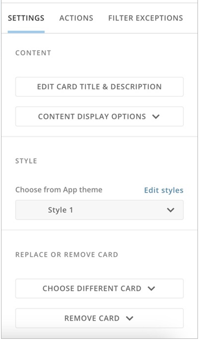


- Selecting Choose Different Card allows you to select another card from your Domo instance.
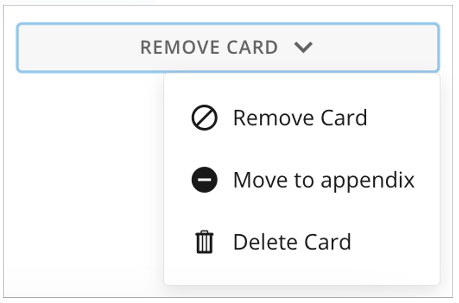
-
Selecting Remove Card
displays three options:
- Remove Card — Displays a message that you are about to remove the card from the app page. If you remove it here, it does not remove the card from other apps or dashboards. Select Remove Card or Cancel.
- Move to appendix — Moves the card to the end of the appendix.
-
Delete Card — This option displays a message warning that deleting the card removes it from all other dashboards and apps and cannot be undone. Select Delete Card or Cancel.
Actions Tab
In the Actions tab, you can define what actions take place when you select the card.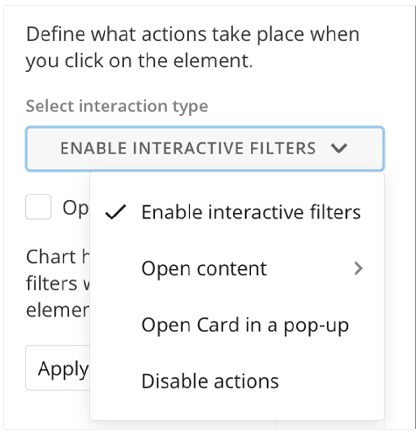
-
Enable interactive filters — You can check the box to open card details in a new tab.
You can also select to which of the following elements to apply chart highlighting and Interaction Filters:
- Apply to all cards
- Apply to selected cardsYou can also choose to disable the Interaction Filters.

-
Open content — Allows you to select whether the action opens a page in the app, opens any content, or opens a URL. For any of the options, you can configure the mobile to follow the desktop interaction or toggle the switch to hide that particular element on mobile.

- If you choose to Open Page in App, choose which page in the app to open. You can check the box to Persist filters, meaning that any filter selections applied to the current page of the app are also applied to the destination page. You can also check the box to open the app page in a new browser tab.
- If you choose to Open Any Content, a modal displays where you can select which content from your Domo instance to open. After you have chosen the content and selected Save, you can change the content. You can also check the box to open the content in a new browser tab.
-
If you choose to Open URL, you can enter the URL you want to open. The URL must include ” https://"". You can enter alternative display text for the URL. The box that opens the link in a new browser tab is checked by default, but you can clear it.
- Open Card in a pop-up — When this option is selected, clicking on the card title opens the card in Story Presentation Mode. The card displays current data and any filters that affect the card. Learn more about Story Presentation Mode.
- Disable actions — When this option is selected, the card does not allow interactions. It displays current data and filters.
Filter Exceptions Tab
In the Filter Exceptions tab, define how the card is affected by filters, global date, and segments. Select one of the available options:- Allow filtering — Allows all Filters to affect this card, including interaction Filters.
- Allow global date — Allows the global date to filter this card.
- Allow segments — Allows all segments to be displayed on this card.
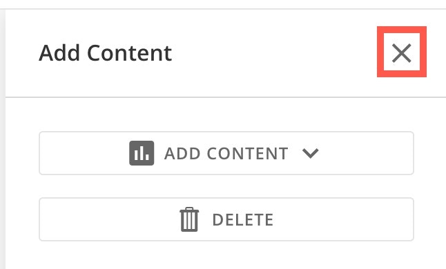
Add a Card
Dragging a card element onto the canvas displays two options: Add Content and
  Delete.
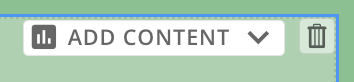
 Delete removes the card(s) from the canvas.
Selecting
Delete removes the card(s) from the canvas.
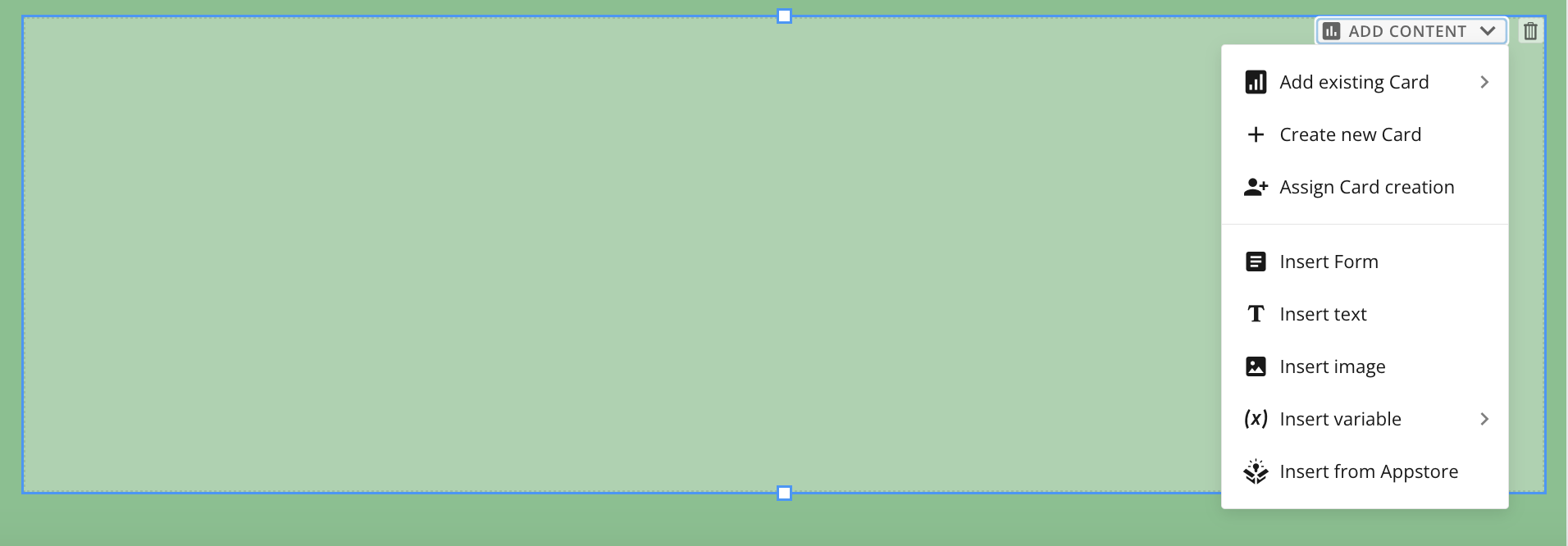
Selecting  Add Content expands the following options, described below:
- Add existing card — Allows you to choose from existing cards in your Domo instance to add to your layout.
- Create new card — Prompts you to save changes to your app before allowing you to create a new card. The Add a Card modal then displays, allowing you to choose to create one of several card types.
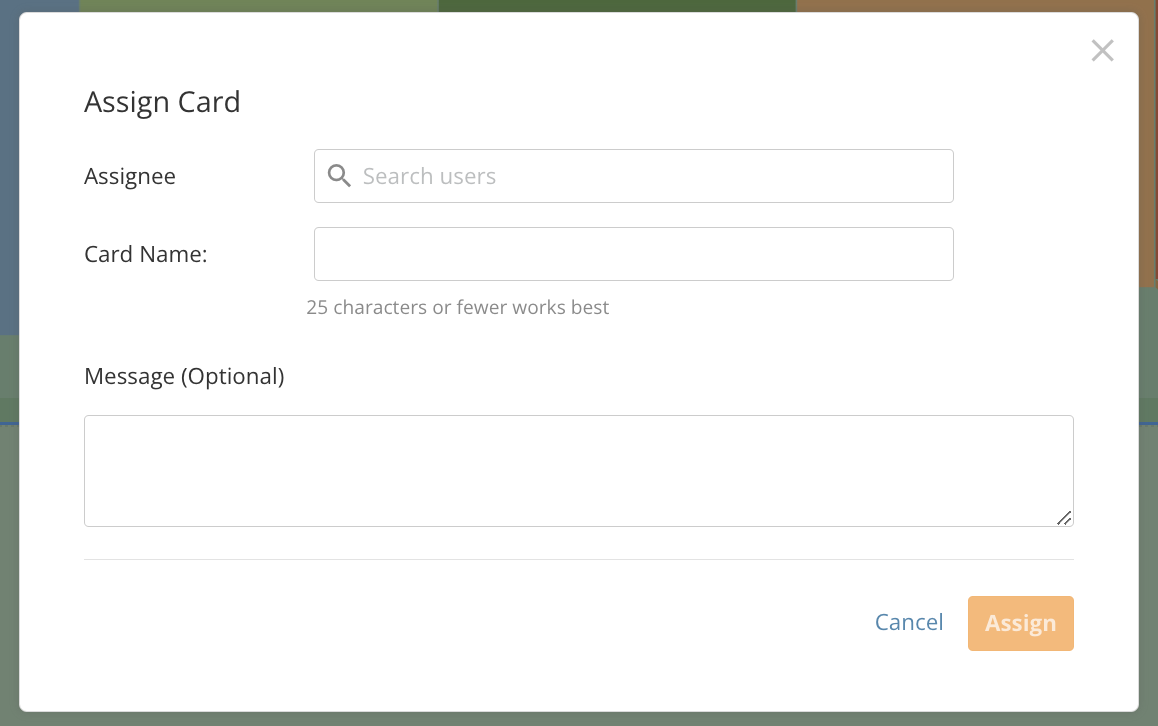
-
Assign card creation — Allows you to assign card creation to a user in your instance. You must include the assignee’s name and the name of the card (25 characters or fewer). You can also include an optional message to the assignee. After entering the details, select Assign to notify the assignee or Cancel to discard your assignment.
- Insert form — Displays the Select Form modal, which allows you to choose a form to include in your app, or select Create New Form. To learn about creating forms, see our Forms documentation.
- Insert text — Displays the Notebook Card toolbar on the canvas and opens the right side panel as a notebook. Learn more about Notebook Cards. Learn more about inserting text.
- Insert image — Allows you to select an image from your machine to add to your canvas.
- Insert variable — Allows you to add a variable to the canvas, similar to adding a variable to a dashboard. To learn more, see the Variables | Overview.
- Insert from Appstore — Allows you to select an app from the Appstore to insert into your app.
Add a Queue
Dragging a Queue element to the canvas opens the Select queue modal. In the modal, locate the queue you want to add and select Choose.
Add a Workflow
Dragging a Workflow element to the canvas allows you to choose an existing workflow. When a user views the app, the workflow’s start form displays. When the app user fills out the form and submits it, the workflow executes.
Download Content from a Doc Card
App users can only download the file (document, presentation, photo, video, or other) embedded in an App Studio Doc Card if presentation mode is enabled when the card is added to the app. This process is described in two parts: first, the app creator enables presentation mode for a Doc Card; second, an app user downloads the applicable file.Enable Presentation Mode for Doc Card
Presentation mode is off by default. Enable it by following the steps below. To begin: Open your App Studio app in edit mode and select the Doc Card where the file you want users to download is located.-
In the Settings tab of the right configuration panel, select Content Display Options > Presentation mode.
A checkmark displays by “Presentation mode,” meaning it is enabled for the card.
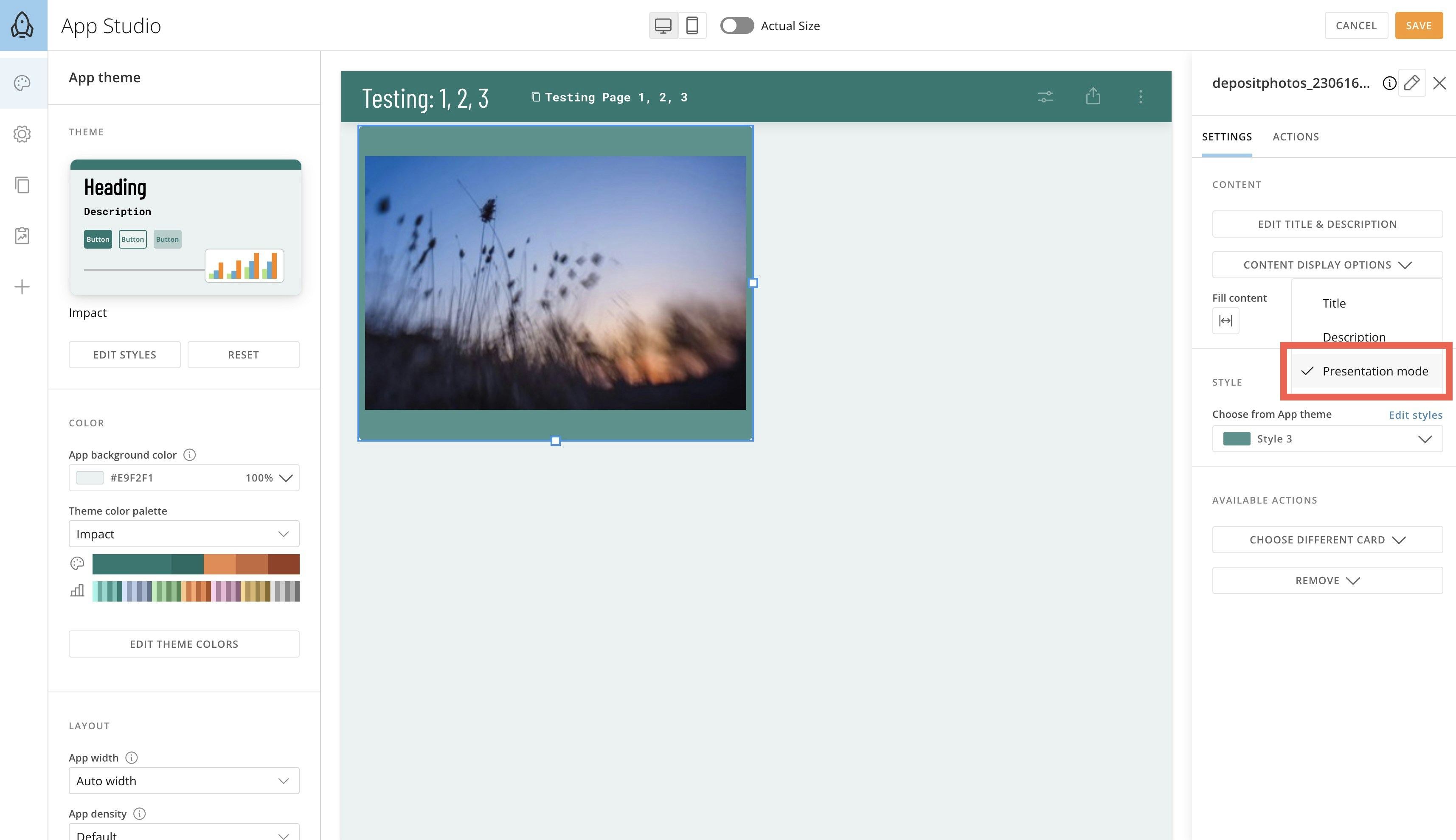
- Save the changes to your app and close edit mode.
Download a Doc Card File
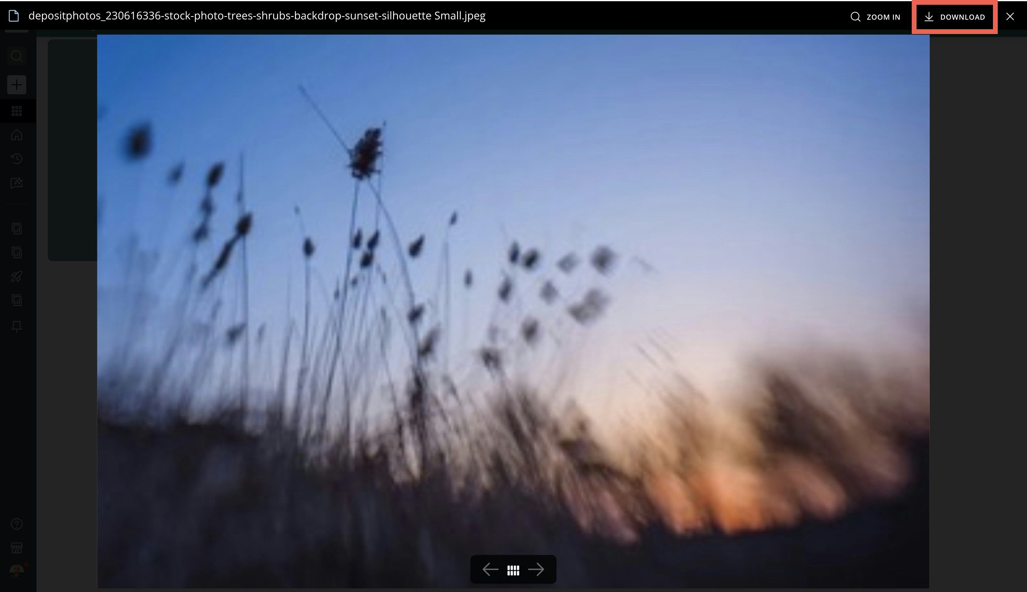
While viewing an app, if presentation mode is enabled for a Doc Card, an app user can download the file locally by following the steps below. To begin: Open an app in view mode and locate the Doc Card containing the file you want to download.-
Hover over the card and select
 Expand to open presentation mode.

-
Now select Download at the top of the screen.
The file is downloaded locally.