Fall is all about candy corn, costumes, and caramel apples. We watch scary movies and visit haunted houses just for fun.
While some might find Halloween a bit morbid, many cultures honor the dead with candy skulls and graveside celebrations.
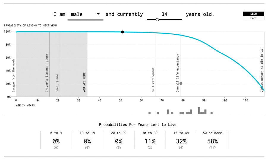
Despite medical science’s best efforts, we’re still without a cure for kicking the bucket. Although we can’t avoid the inevitable, a new visualization from FlowingData uses real data to take a stab at it.
Years You Have Left to Live, Probably combines information from the Social Security Administration and the Center for Disease Control to calculate the window of your death. All you have to do is input your age and sex and watch as falling marbles tell your fate.
Check out the full visualization at FlowingData
With the latest technology, it’s easier than ever to turn information into thought-provoking visualizations like this. At Domo, we’ve helped companies like SAB Miller and Stance gain insights from massive amounts of data.
Understanding information helps us unlock valuable insights. Albeit morbid to some, knowing the date of your death would sure make retirement planning a lot easier.
Check out the full visualization on FlowingData.
[Nod FastCompany]