The top seven best dashboard design practices
As an integral part of business intelligence tools, dashboards have been game-changing for businesses.
Dashboards allow businesses to make use of their data and gain a comprehensive view of company performance, with clear data visualizations that present easy-to-digest insights.
More than this, data insights obtained from dashboards can be used by different individuals and departments to further their success by using both current and historical data to guide their decisions about everything from marketing to operations.
However, just as important as the data itself, effective dashboard design is critical to getting across the message conveyed by the data.
With this in mind, here are seven guidelines for effective dashboard design that allow the story told by data to be understood easily — and instantly.
1. Determine the objective of the dashboard
To execute a stellar dashboard design, it’s essential to first determine the goals of the dashboard.
To accomplish this, make sure to consider your audience. It’s a good idea to talk to the dashboard’s end-users to figure out what they most need from the dashboard. What questions do they need answered? What are the most important metrics to track? How much detail do they need?
If it’s not feasible to talk to end-users about the dashboard — perhaps C-suite executives or potential investors — you can tailor your dashboard design using what you know about these audiences.
For example, C-suite executives will need a dashboard that shows an accurate and revealing portrait of company performance, with plenty of opportunities to click through and view the data in more detail.
This makes functionalities such as ‘drill-down’ and dashboard-wide filtering a good idea to include on your dashboard, since these individuals will have a huge amount of knowledge and will gain more from being able to see the nitty-gritty, as well as the overall view.
On the other hand, when executing dashboard design with investors in mind, the priority is clarity.
Investors don’t typically know the ins and outs of your business — or potentially even your industry — so your dashboard design should focus on telling the story illustrated by the data, ensuring that everything is clearly labeled to eliminate the chance of investors misinterpreting the meaning of the data visualizations.
Once you’ve determined what your audience needs and will gain value from on your dashboard — and outlined what the exact purpose of the dashboard is — you can begin to select the components that make it up.
2. Focus your metrics
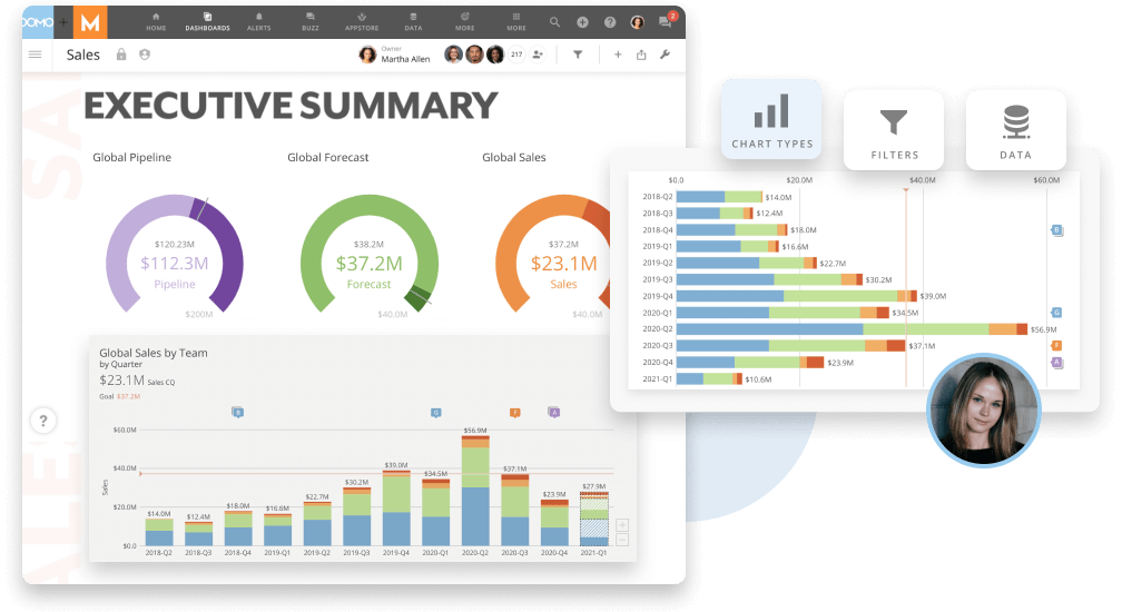
In his book Information Dashboard Design, Stephen Few defines a dashboard as “a visual display of the most important information needed to achieve one or more objectives; consolidated and arranged on a single screen so the information can be monitored at a glance”.
This definition outlines a critical criteria: that your dashboard design should be no more than a single screen, with enough information to allow the viewer to understand the story depicted by the data, but not so much that it’s difficult to take it all in.
If your dashboard design is too busy, it’s likely your audience will become disengaged from the dashboard and potentially miss important details.
With this in mind, choosing the five to nine most important metrics to display as data visualizations is a good idea, presenting enough detail to knowledgeably drive decisions but not so much to overwhelm the viewer and distract them from the most important messages presented by the data.
As a rule of thumb, your viewer should be able to surmise the key insights from your dashboard within five seconds of viewing. If that’s not possible, you might want to consider reducing the amount of content present on your dashboard.
3. Use the most appropriate data visualizations
When you’ve selected the metrics — and the data — most critical to fulfilling the objective of a particular dashboard, it’s important to choose the right data visualization for that data and for the overall dashboard design.
For example, to compare multiple variables, bar charts are a great choice, while line graphs are best for displaying data in which viewing changes over time is important.
Something to watch out for at this point in your dashboard design journey is that you’re not overdoing the visualizations. Great dashboard design favors clarity and simplicity.
So, if you’re trying to highlight a metric that can be summarized by a single figure, don’t try to do anything fancy like add a gauge chart when just the number and a clear label will do the trick.
Likewise, certain visualizations can distort the significance of certain data, so you should always try to pick the visualization that most objectively depicts the story the data is telling. For example, data visualizations such as 3D pie charts can sometimes exaggerate the appearance of data values and categories, so they might be perceived to be more significant than they are.
4. Position visualizations strategically
More than the data you choose and the visualizations you opt to use, the positioning of each component is similarly important to creating the most effective dashboard design.
In general, you should display the most important metric in the top left corner of the dashboard since this is where the eye naturally wanders first (in languages where the natural reading pattern is from left to right, as with English).
Like with reading, the user’s gaze is likely to travel across the top row, then to the left of the middle row, and so forth.
With this in mind, it’s a good idea to display visualizations in this order, in a way that best illustrates the story told by the data, allowing you to carry out dashboard storytelling with your dashboard design.
Many dashboard design experts also choose to use an ‘inverted pyramid’ approach, which can be used simultaneously to – or in place of – the above. This is where the most significant metrics are placed on the top row, trends are displayed in the middle row, and granularity is positioned at the bottom of the page for users who want to see more detail.
Moreover, you can choose to group related metrics or visualizations that you want to be read together by using differing amounts of white space to emphasize different groups of metrics and visualizations.

5. Provide context
As we mentioned earlier, clarity is a defining characteristic of a well executed dashboard design.
Without context, numbers are just numbers and data visualizations are just graphs. With that being said, there are a couple of ways in which you can provide context.
The first step is ensuring that data visualizations are contextualized by making sure that graphs are clearly titled and labeled, so users can’t misinterpret what they’re seeing.
Second, often users won’t have the background knowledge themselves to know if a number is good or bad. To fill this gap, historical data is usually necessary to provide context on whether a recorded metric is on track, worse, or better than it has been in the past.
Likewise, it can also be useful to use color – such as red and green – to highlight whether a metric is meeting or falling behind on your goals.
6. Eliminate clutter
To allow users to focus on what they need to – a.k.a. on the data visualizations and the story told by the data – it is essential to make sure your dashboard is free from clutter.
This includes avoiding unnecessary decoration, including grids or lines that don’t serve a function, as well as forgoing complex data visualizations when simpler visualizations will convey the data findings just as well – and with less confusion on the part of the user.
This can also mean using abbreviations, such as using a ‘%’ sign, rather than typing out ‘percentage’ to reduce the busy appearance of the dashboard.
Moreover, a sufficient amount of white space is necessary to make the whole dashboard easier to take in and to avoid overwhelming the viewer. White space plays a big role in executing dashboard design with a clutter-free appearance.
7. Use a consistent design scheme
Another tip to ensure your dashboard design is telling the story of the data as clearly as possible is to be consistent.
What we mean by this is that if two or more sets of data are related, it’s best to use the same kind of data visualization for that data – rather than use as many different types of charts and graphs as possible – so that data can be more easily compared and analyzed.
This is a good idea when comparing the same metrics for a few different things; it’s a lot easier to see how the performance of, for example, three products differs when the design is the same, so that differences in design aren’t interpreted as differences in data.
For the same reason, using a consistent color scheme throughout your dashboard design can help to eliminate any potential confusion.
Dashboard design: the key to powerful BI
Dashboards are the core of most businesses’ BI strategy. To make the best use of their BI tool, businesses need to design and implement useful, intuitive dashboards, and they need to know how to design good dashboards to do that.
The basics of dashboard design aren’t difficult to understand, but dashboard designers do need to understand them. At their core, dashboards need to be focused on meeting one business need, should have a clear visual hierarchy, and should present their metrics in the most effective way possible.
The best way to make good use of dashboards is to buy a BI tool that has powerful dashboarding and visualization features. Your BI tool should have the features you need to build the most effective dashboards possible.