Data visualization tools enhance decision making by uncovering insights
In today’s fast-paced, agile market environment, the amount of data generated is massive, and it’s only growing. Between customer data for insight into future trends and internal data related to previous decisions made, gathering and collating all of that data feels impossible.
So how can you make sense of so much information? One technique is to create visualizations that show more than the raw numbers ever could. For instance, a graph can compare two variables instantly—something that would take much longer to do with written descriptions of those same variables.
Data visualization tools are the best way to make sense of large datasets. While it’s hard to look at a table and know what action you should take, a robust data visualization tool allows you to zero in on different business questions and find answers.
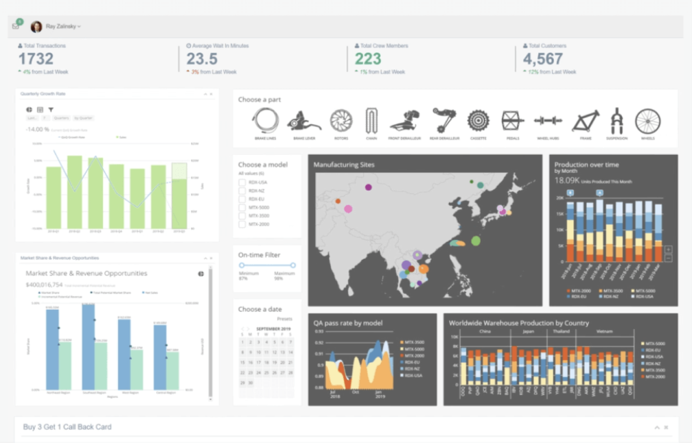
Data visualization software helps to uncover insights about your business and also supports decision-making processes by presenting complex data in an easy-to-understand format. This could be anything from simple charts to complex graphical dashboards that offer an overview of an enterprise’s performance with only a moment’s glance. Visualization tools are primed to change the way we conduct decision-making.
Custom data visualization tools are becoming rapidly available to everyone
As the business intelligence industry has grown, so have the tools used to deliver insights. These tools have become more sophisticated and user-friendly over time. They’ve also become more accessible as they’re moving towards cloud-based solutions, which facilitate the deployment and management of data analysis projects.
In addition to this trend towards accessibility, there’s been a steady decrease in price for these tools—a factor that’s particularly important for small businesses that are just getting their feet wet with analytics technologies.
Although those first few generations of big data visualization software were very powerful in their own right (and still are), newer versions take advantage of increasingly complex algorithms that enhance decision-making processes. This includes integrated, easy-to-understand, low-code or no-code solutions that provide a drag-and-drop interface, decreasing the need for internal experts to provide support.
Dealing with proper data for visualization
The cost of the visualization tool you utilize is not only the purchase price but also the resources you’ll need to train employees how to use it. If you’re using a visual analytics tool for the first time, expect there to be an initial learning curve while you figure out what each feature does and how they interact with each other.
The cost of data analysis through visualization depends on whether or not the source data has been cleaned (meaning that all variables have been checked for accuracy) before analysis begins. If so, then less time will be spent cleaning up errors within datasets since this step has already been completed during preprocessing. This could include finding missing values or checking range restrictions on the variables in question.
If any of these steps have been skipped or the data hasn’t already been cleaned up beforehand, then there may be additional work required before beginning any visualization at all, slowing down the integration. In other words, having a reliable data lifecycle is key to modern data visualization tools.
Things to consider before data visualization begins
What data are you trying to visualize?
How much data do you have? What type of data is it? Data can be categorized in many ways, but it’s useful to know what kind of information your dataset contains (e.g., demographics, sales figures, customer preferences, etc.).
How often do you need to update the data? If there are time-sensitive aspects of the information that need regular updating—like a stock ticker or weather forecast—this will be an essential factor in determining which visualization tool is best for your project.
How much data is there in total? This question will determine how much time should be spent building an interactive visualization tool versus simply creating static reports and charts from pre-existing datasets. It will also help determine whether or not certain features will work well enough with minimal effort on behalf of the team responsible for using and implementing different BI or data dashboards.
What decisions do you want to make based on the visualizations?
In order to make the most of your data, it’s important to first identify what decisions you want your data to help you make. In other words, what are the business questions that need answers?
For example, you may want to know if a particular marketing campaign is working or not. Or perhaps you want to see how many customers have abandoned their shopping carts and why they did so.
Once you’ve identified which decisions need answers and why they’re essential, it’s time to start exploring your options. It helps to integrate a cross-departmental team to figure out these questions, so the final graphical visuals are highly relatable to your particular business goals and KPIs.
Who needs to interact with these visualization tools?
Visualization tools are not just for data analysts. They can be used by anyone in your organization, regardless of their skill level. Visualization tools are easy-to-use, intuitive, and accessible via desktop computers as well as mobile devices such as tablets and smartphones.
That does not mean everyone inside of an organization needs to be looking at the same data. Consider which team members, stakeholders, managers, and investors will be viewing these visualizations so you can create the best dashboards for your unique company.

What are the benefits of data visualization?
The main benefit of data visualization is that it can make analyzing complex information easier for business people and group numerous data points into one easy-to-understand dashboard.
We are programmed to understand the visual representation of data better than raw numbers in spreadsheets. Think about how much easier it is to read an infographic versus reading through pages of statistics. When you visualize data, you create a quick and simple way to digest complex information in a way that quickly reveals trends and relationships between data points—which would take hours to analyze by looking at rows and columns in your spreadsheet.
Other benefits include the following:
Increase data collaboration
Our brains are wired for visual thinking, and that’s why data visualization tools are such an important part of decision-making today. As a result, companies have set their sights on creating more effective and efficient dashboards that help them make better business decisions based on real-time data analytics.
Sharing dashboards within an organization helps employees stay on the same page and creates conversations about data insights. This encourages collaboration as well as innovation.
Uncover insights and trends
Visualization tools are useful for uncovering trends, patterns, and comparisons that might not be obvious from looking at numbers alone.
For example, a chart can show you if your revenue has increased over time or what percentage of orders come from a particular source. Likewise, maps can help you see where your customers are located around the world and whether there’s any correlation between location and product preference.
Discover problems and prevent errors
One of the benefits of visualizing data is that it makes errors more apparent. When you’re looking at your numbers and trying to make sense of them, errors can be difficult to spot. Visualizations make it easier for you not only to see where there are problems but also to understand where they’re coming from.
The fact that visualizations help with error detection is a big plus because fixing errors is often more time-consuming than finding them in the first place. In addition, when you have an issue that needs resolving or an error in your analysis, being able to reproduce it quickly can make all the difference between solving your problem and letting it go unsolved due to lack of knowledge or resources.
Speed up decision making
Your organization is constantly working to stay ahead of the competition, so it’s important to make decisions quickly. Whether you are a data scientist or a business analyst, visualization tools can help you make better decisions faster.
The power of data visualization is fueling BI development
As we move into the future of business intelligence, it only makes sense to integrate more data visualization tools. Companies are enjoying the many advantages of having KPIs easily available at a glance through modern BI dashboards with visual graphs and charts.
It’s clear by now that there’s nothing else like what we have today in terms of data visualization tools. They enable us to see things much more clearly without having to be experts in statistics or math. Once you know how to use these tools properly, this technology will become an indispensable part of your toolkit for navigating business challenges and cultivating future organizational growth.