Bar Charts
Data Visualization with Bar Charts
When Should You Use a Bar Chart?
Simple Use Cases for Bar Charts
Using a Bar Chart in a Dashboard
Tips for Using Bar Charts
Try Domo for yourself.
Completely free.
Data Visualization with Bar Charts
Likely the most commonly used chart type, a bar chart is a simple visualization that is easily understood by all user types. An excellent way to compare objects with the same parameters, a bar chart plots numeric values as bars. One axis plots categories, the other a value scale. Each categorical value is represented by bars of equal width with lengths proportional to their value. Bar values can be compared because they are plotted on a common baseline.
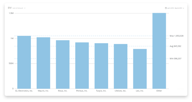
There is a wide variety of bar chart types, but the most commonly used type is a vertical bar chart. The categories are on the x-axis and the values are on the y-axis. To build a bar chart, you need two columns of data, one for categories and one for values.

When Should You Use a Bar Chart?
Bar charts are ubiquitous and fit a wide range of use cases and data types. They let you see at a glance what bar (or numerical grouping) is most important by comparing values across several categories at once. Use them to answer questions like, “What was our best performing quarter?” or “Which team member received the most votes?”.
Consider using a bar graph as part of a presentation to a larger group. Because they are easy to understand and widely used, your audience will be able to grasp key concepts effectively. For example, a bar chart is a helpful way to show a leadership team the number of bugs found and corrected in a piece of software. Showing the number of corrections each month can indicate improvement in reducing the number of bugs deployed to production.

Simple Use Cases for Bar Charts
You can use bar charts to help inform business decisions for a wide range of use cases across departments:
- Compare revenue between businesses. Use a bar chart to compare financial data. Plot revenue for your company against your competitors to see how you stack up.
- Highlight budget variance. Bar charts are excellent at showing both positive and negative values. This will allow you to compare variances in budgets across multiple departments and determine if budgets need to be adjusted.
- Visualize best to worst performers. By sorting the categories from highest to lowest, a sales manager can quickly see which team members are top performers and the difference between the highest and lowest performers. This will allow you to focus training and support resources.
- Categorize survey responses. Chart the values of different responses to visualize the most important issues your customers are highlighting. The bar chart can help to determine new product features for your roadmap.
- Track historical sales performance. Use a bar chart to compare quarterly sales revenue for the last several years. Visualizing the data this way will allow you to track trends and compare current sales to historical performance.
Using a Bar Chart in a Dashboard
There are many different varieties of bar charts that can present different information. Consider using some of the following bar chart types when building a dashboard:
- Stacked. Use a stacked bar chart when you want to show off the parts of multiple totals. For example, when comparing each product’s sales performance across multiple quarters.
- Nested. Compare two data series per category by having one bar on top of the other. Or display multiple sets of data bars side by side with a total bar behind.
- Horizontal. This is a good one to use when you have long category labels or a very large set of categories to compare.
- Grouped. Use it when you want to compare multiple sets of data.
- Lollipop. This can be effective when you have multiple bars of similar lengths. It can help to reduce visual clutter.
- Value Line. A value line can more effectively highlight trends in your data.
While bar charts are ubiquitous in business intelligence reports, they can’t always convey nuances in the data like patterns, effects, or key assumptions. Consider pairing a bar chart with a bubble chart to highlight outliers in your data and a forecasting chart to predict how trends highlighted by the bar chart will look in the future.

Tips for Using Bar Charts
There are some key points to consider when utilizing a bar chart to visualize your metrics.
Use a zero-point baseline.
It can be tempting if your values are all in a range from 90-100 to start your baseline at 90. But this won’t convey a clear picture of true trends in your data. Using a zero-point baseline ensures you’re not manipulating the data in any way and aren’t creating false impressions of data variances for your eventual viewers.
Avoid icons to depict values.
Some charts use icons related to the subject matter instead of bars to plot values. It can add an element of uniqueness to a chart, but it can also greatly impact the readability of the chart. Information can be misconstrued when the icons are stretched or made larger, not showing true relationships between the sets of data.
If you truly need to use icons instead of bars, consider a pictogram chart. While still not as readable as bars, pictogram charts use a series of icons to depict value with each icon representing a certain quantity. It can still be more difficult for the reader to interpret values but does avoid misrepresenting key data points.
Sort bars from longest to shortest.
Unless you have a very specific order your bars need to be in (like if they represent units of time or need to be alphabetical), sort your bars from longest to shortest. This will allow the reader to more quickly gather the most relevant information from your chart and will provide an easier comparison to the close values.
Bar charts will likely be a visualization tool you use in most reports. They will convey your data story clearly and will be understood by a wide audience. While you rarely can go wrong with a vertical bar chart, don’t be afraid to branch out and use other versions to effectively convey key information.
RELATED RESOURCES
chart
Bubble Charts
chart
Gantt Charts
chart
Period-Over-Period Charts
chart